
Interface design, judged on the decision behind each screen
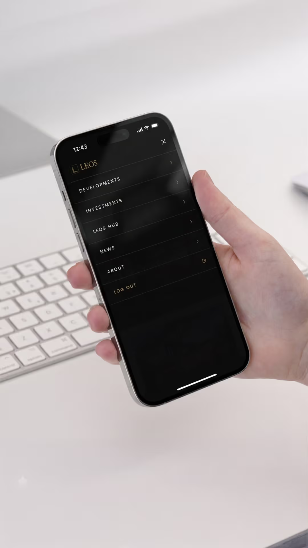
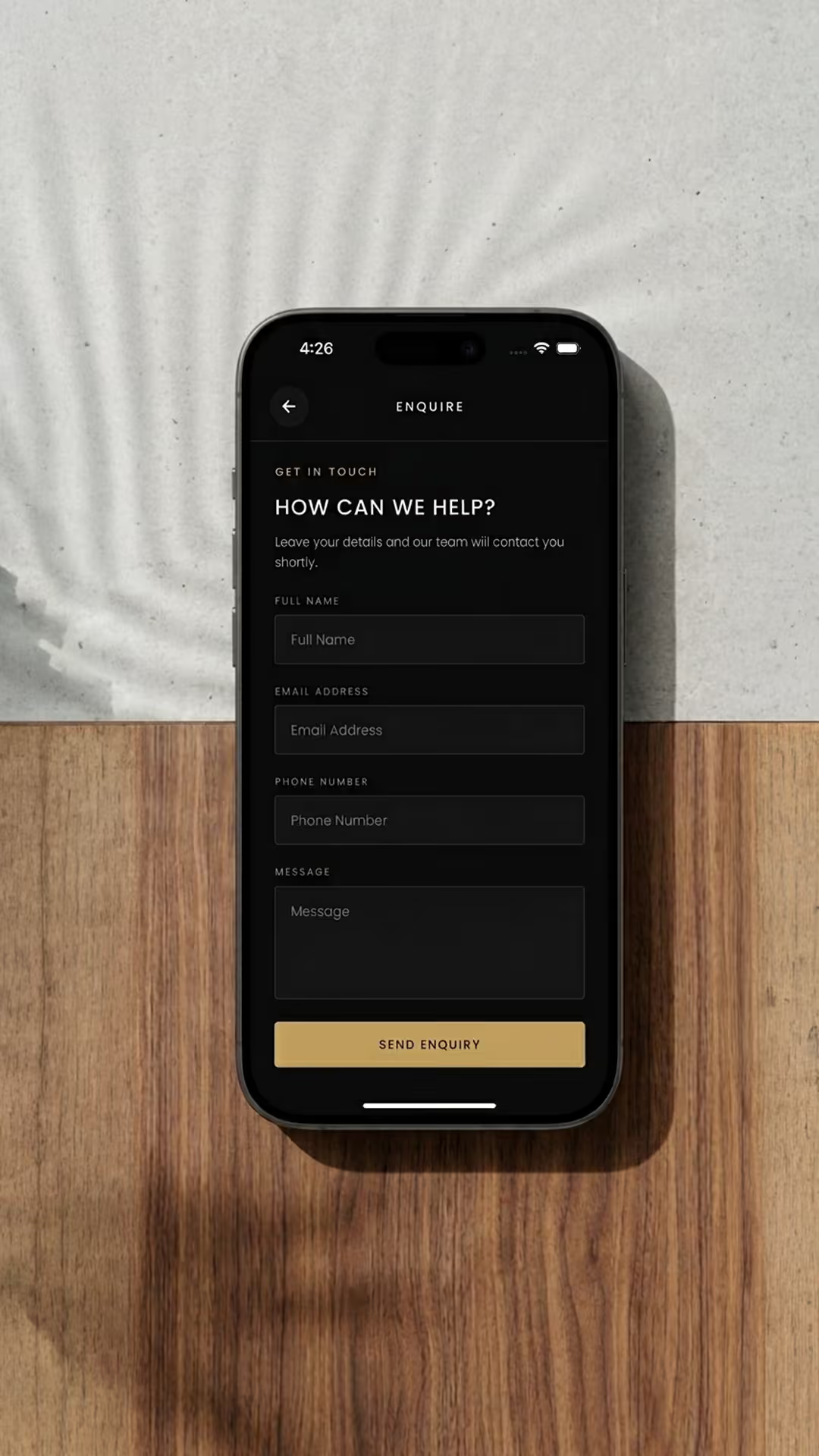
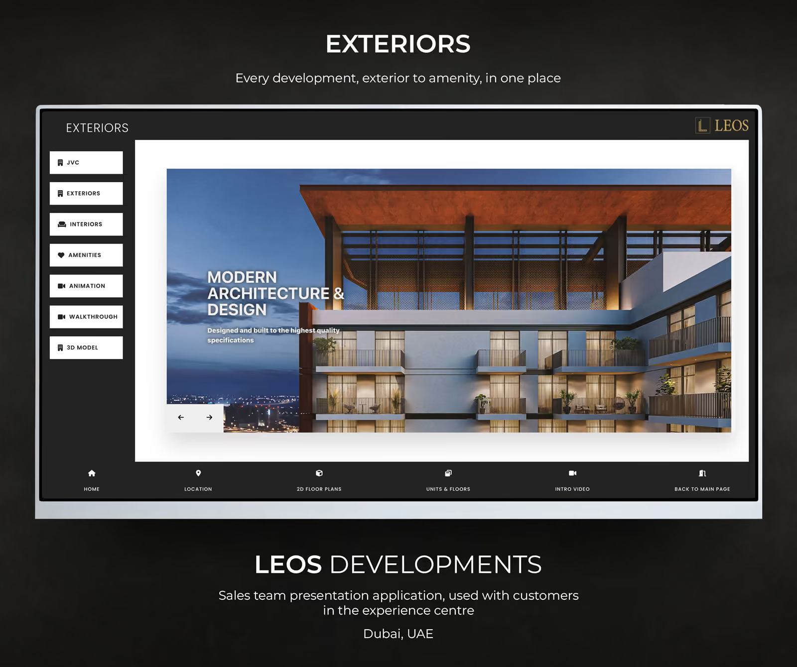
Every screen here is shipped work, not a concept. What is worth looking at is not the surface but the decision underneath it: whether to force a sign-in, whether actions belong on the card or behind a menu, how many fields an enquiry form can carry before it starts costing completions. Each piece links through to the reasoning.
This page is the interface cut. It gathers the app screens and the mobile web layouts in one place because they answer the same question (what does a buyer do on a small screen?) and it is the only page where they sit together with the design reasoning attached.
Mobile layouts
3 captures


App screens
11 captures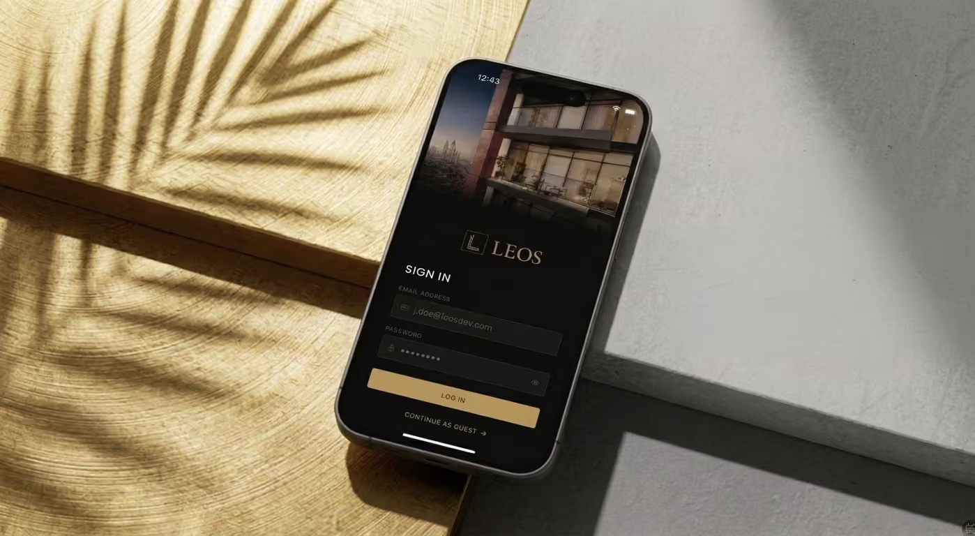



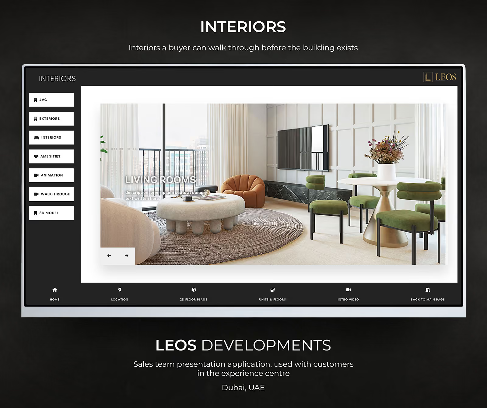
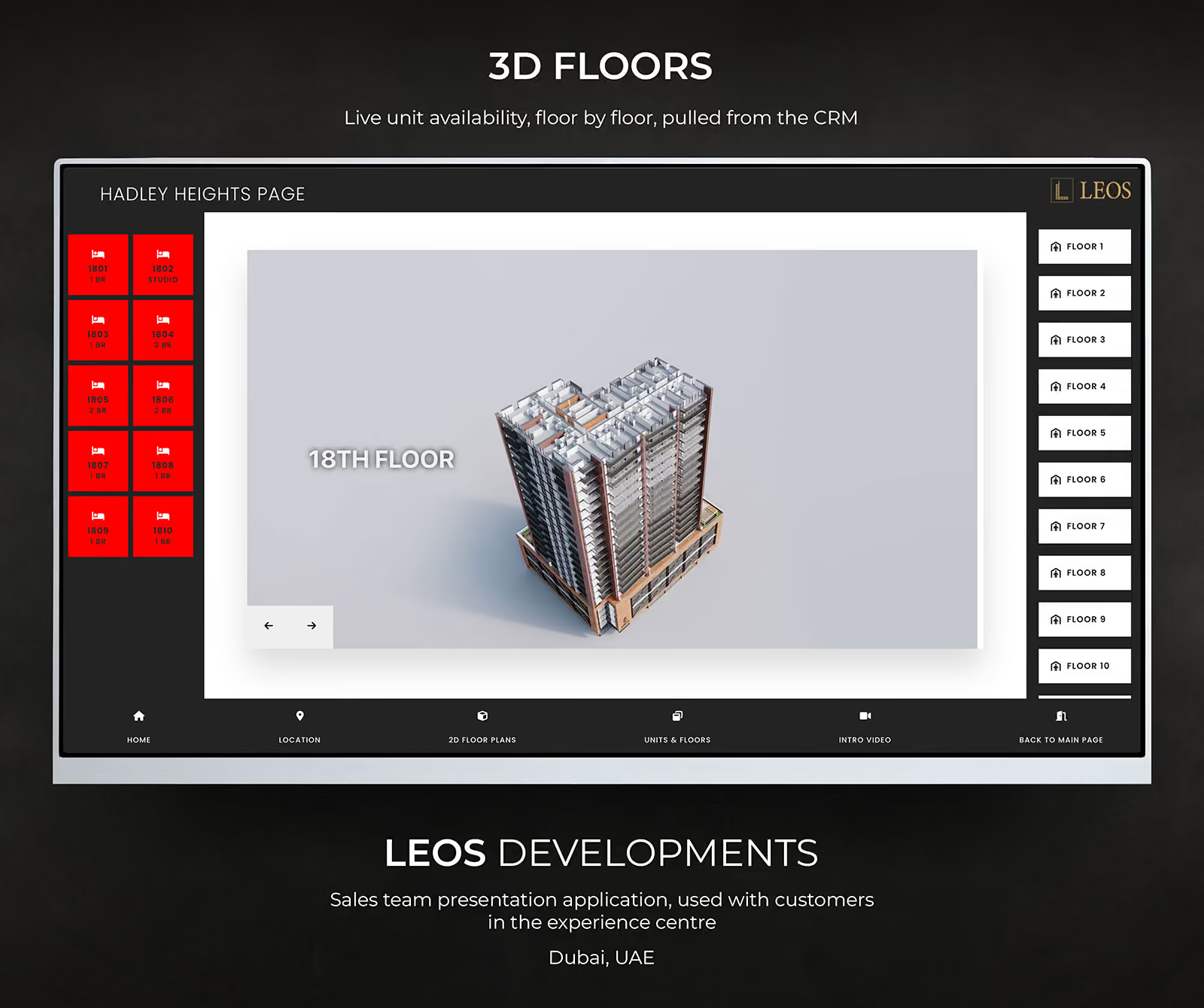
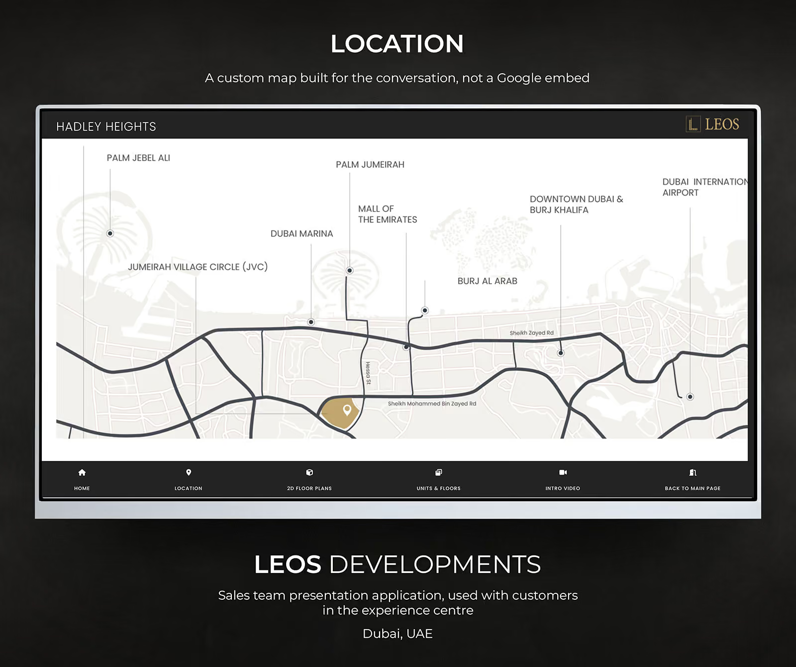
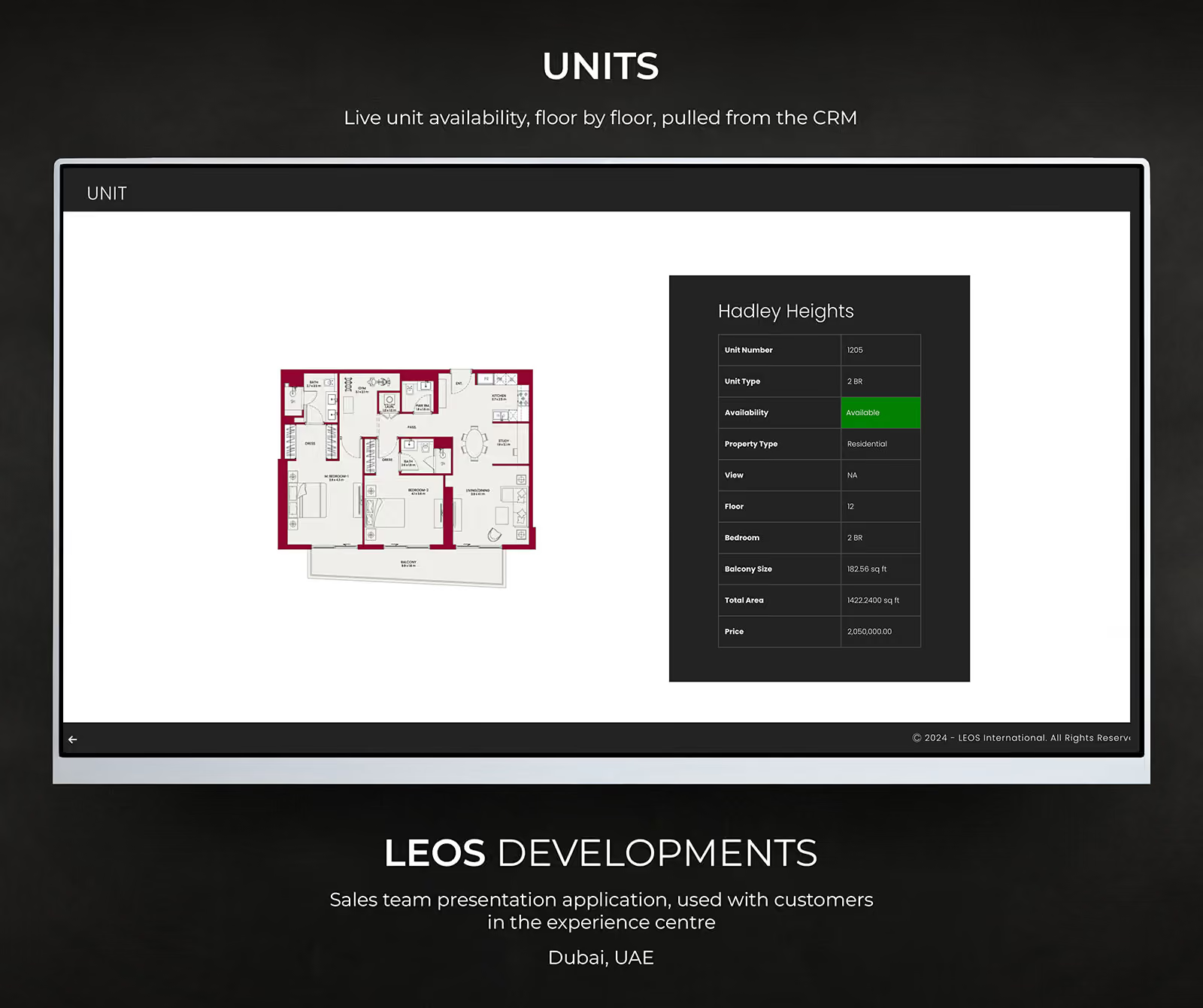
The decisions that do not show in a screenshot
A portfolio of app screens is easy to misread. What you are looking at is the surface, and the surface is the cheap part. The expensive decisions are the ones that produced it: whether a buyer should be forced to create an account before they can browse, whether the primary action sits on the card or behind a menu, how many fields an enquiry form can carry before the completion rate starts falling.
Those decisions are what the client paid for. On the property work they came down to one question asked repeatedly: is this step helping a serious buyer get to a conversation, or is it helping us collect data we will never use? Most of the screens here are shorter than their first draft for that reason.
Designed for the state where things go wrong
The screens that get designed are the ones where everything works. The screens that decide whether an app feels finished are the other ones: an empty list before the first entry, a slow connection, a permission the user declined, a session that expired while the phone was in a pocket, a name sixty characters long.
When those are not specified, the developer decides them under deadline pressure, and they become the parts people complain about. On this work they were specified, which is the main practical advantage of the same person designing and building: there is no handover at which the awkward states can be left out.
Interface work for a property buyer specifically
Off-plan property has a particular problem. The audience is wide, the product is expensive, and most of the traffic arriving from a campaign will never buy. An interface that makes it easy for everyone to enquire produces a long list and a frustrated sales team.
So the design does the qualifying. The entry price appears early rather than being withheld until a form is submitted. One primary action, short enough to finish one-handed on a phone. A brochure download as a lower-commitment second route for someone who is interested but not ready. A separate path for existing buyers, so somebody asking about a unit they already own does not land in the new-enquiry list.
None of that is visible in a screenshot. All of it is why these particular screens look the way they do.
UI / UX Design questions
Do you design as well as build?
Yes, and on the projects here I did both. The app screens and the mobile layouts on this page were designed and then built by me, which is why the reasoning and the implementation match rather than one having been handed over to the other.
Do you work in Figma?
Yes. For a solo engagement I usually keep the design phase short and move into a real, clickable build early, because a working page in a browser answers questions a static frame cannot. If your team needs Figma files as a deliverable, say so at the start and I will scope it in.