
A cross-platform app, from one codebase.
- Platforms
- iOS & Android
- From one build
- Framework
- React Native
- One shared codebase
- My role
- Design & build
- Interface through to delivery
- Screens shown
- 5
- Walked through below
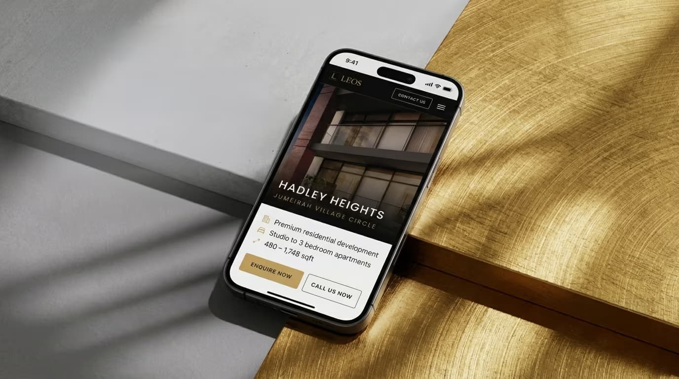
About the project
A two-year engagement covering both the development side and the campaign side, which is unusual for a single supplier: the same person built the website that campaigns pointed at, and made the creative that drove traffic to it.
The problem
Three things constrained this build before a single screen was designed:
- 01
The buyer is often not in the country
Off-plan is frequently bought at a distance, so the app has to stand in for a site visit: the renders, the unit mix and the size range have to be legible on a phone, and the route to a human has to be one tap from whatever the buyer is looking at.
- 02
Two platforms, one small team
Separate native builds would have meant two codebases, two release cycles and two sets of bugs for the same screens. React Native keeps one component tree and one place to fix anything, which is what makes a two-platform app viable without a two-platform team.
- 03
Nothing may contradict the website
The same three developments, the same photography and the same enquiry destination. A buyer moving between the site and the app should never see two different answers to the same question, because the moment they do, both stop being trustworthy.
The solution
The website already sold well. The app had to carry that restraint into something people operate rather than read.
Key challenges
The app had to be operable in one hand by someone who may never have seen the website. That required:
- Guest browsing by default
- Actions sit with the content
- Price on the card, not behind a tap
- Weighted, not evenly split
- Reachable from every card
The screens
5 screens
React Native, iOS and Android
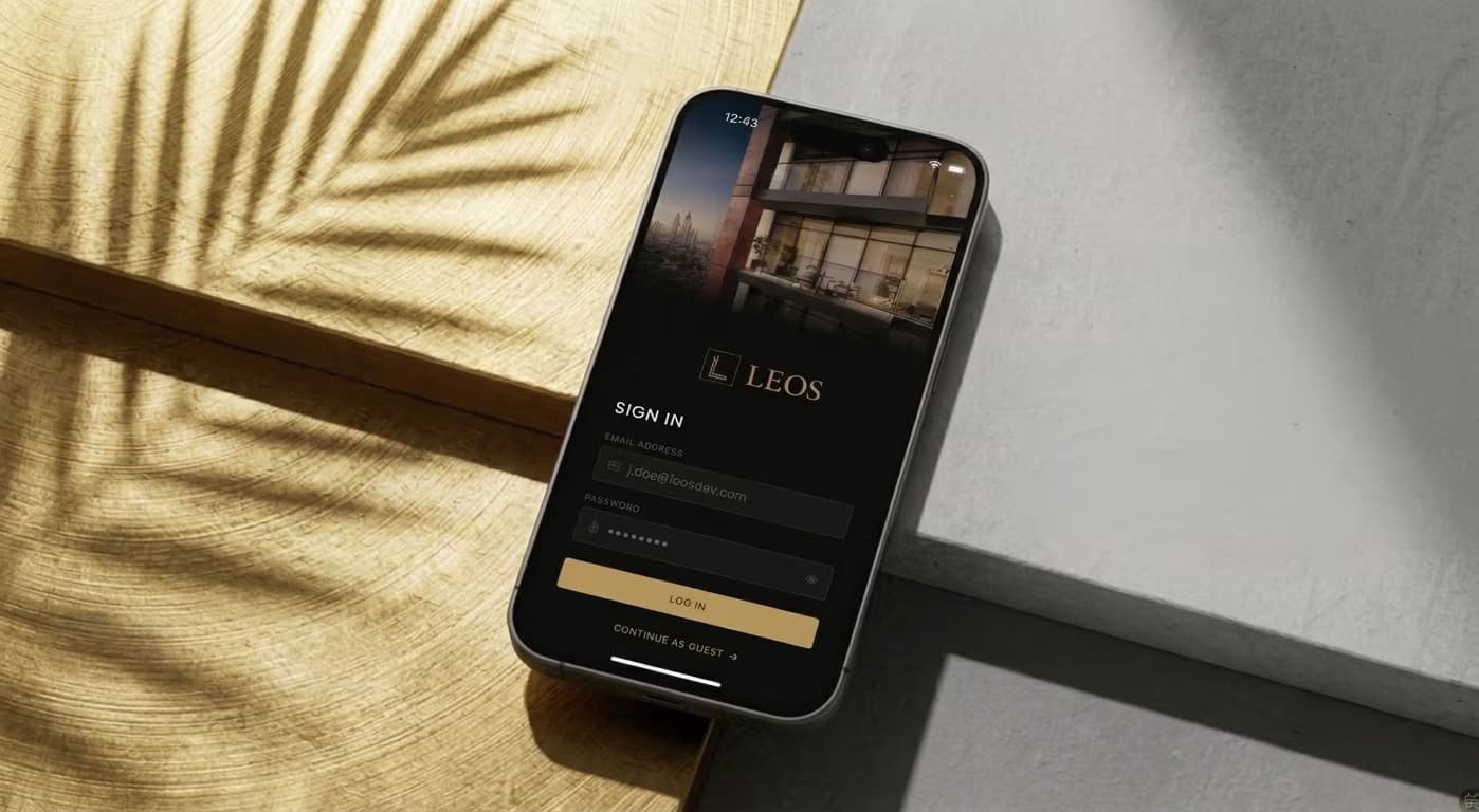 01 / 05Sign in
An account is offered, not demanded.
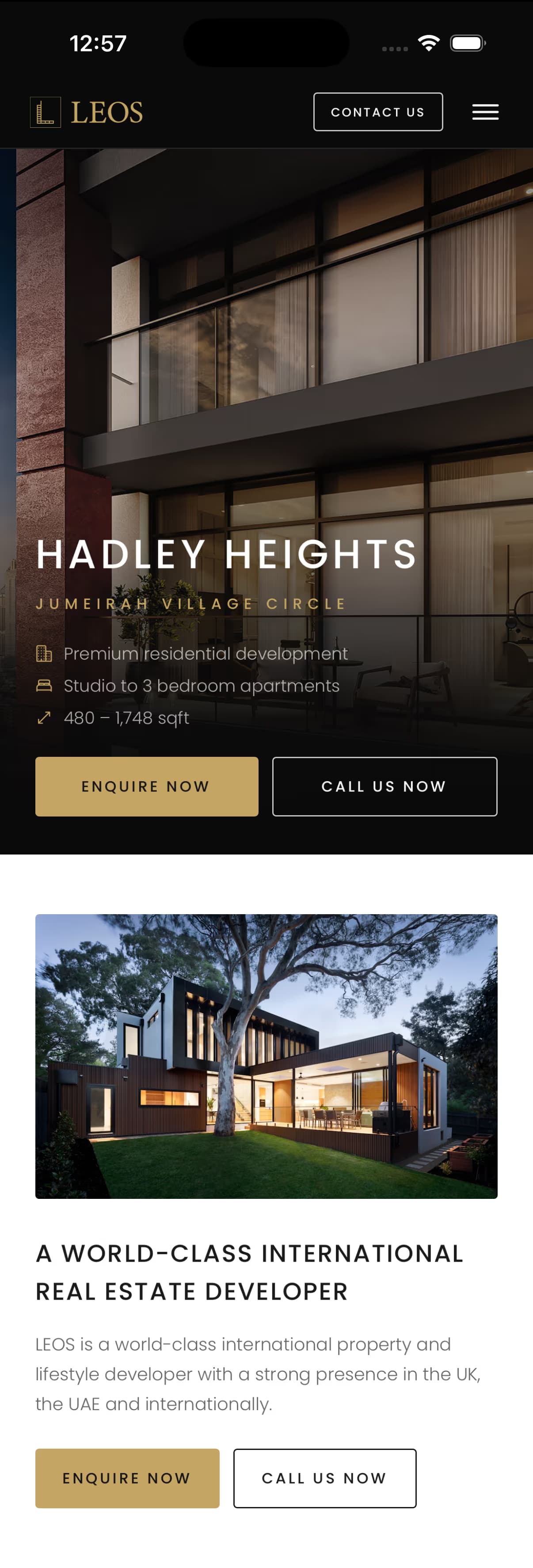 02 / 05Home
One development leads, not a grid.
 03 / 05Developments
The full portfolio, one card per building.
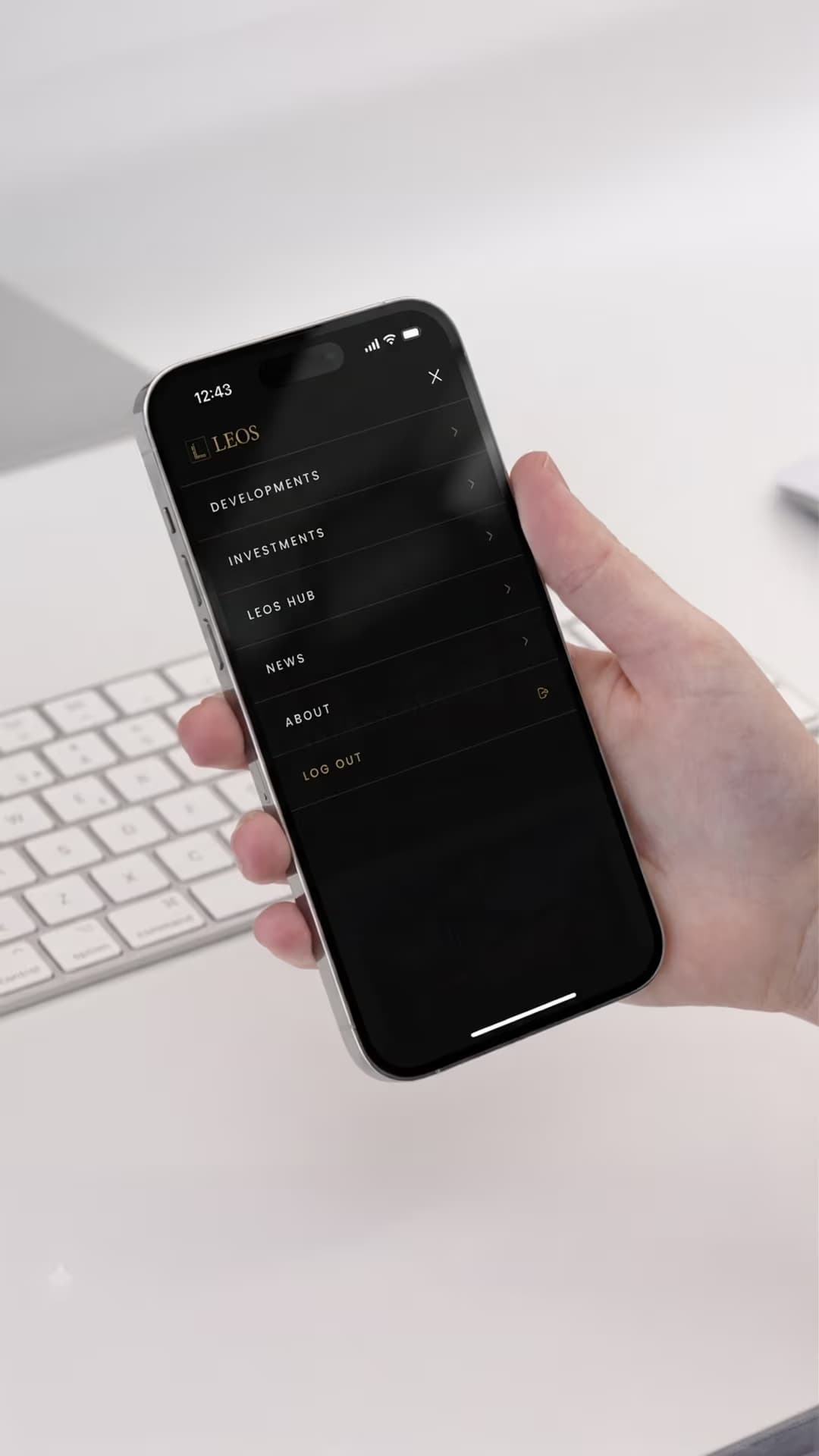 04 / 05Menu
A slide-over, not a tab bar.
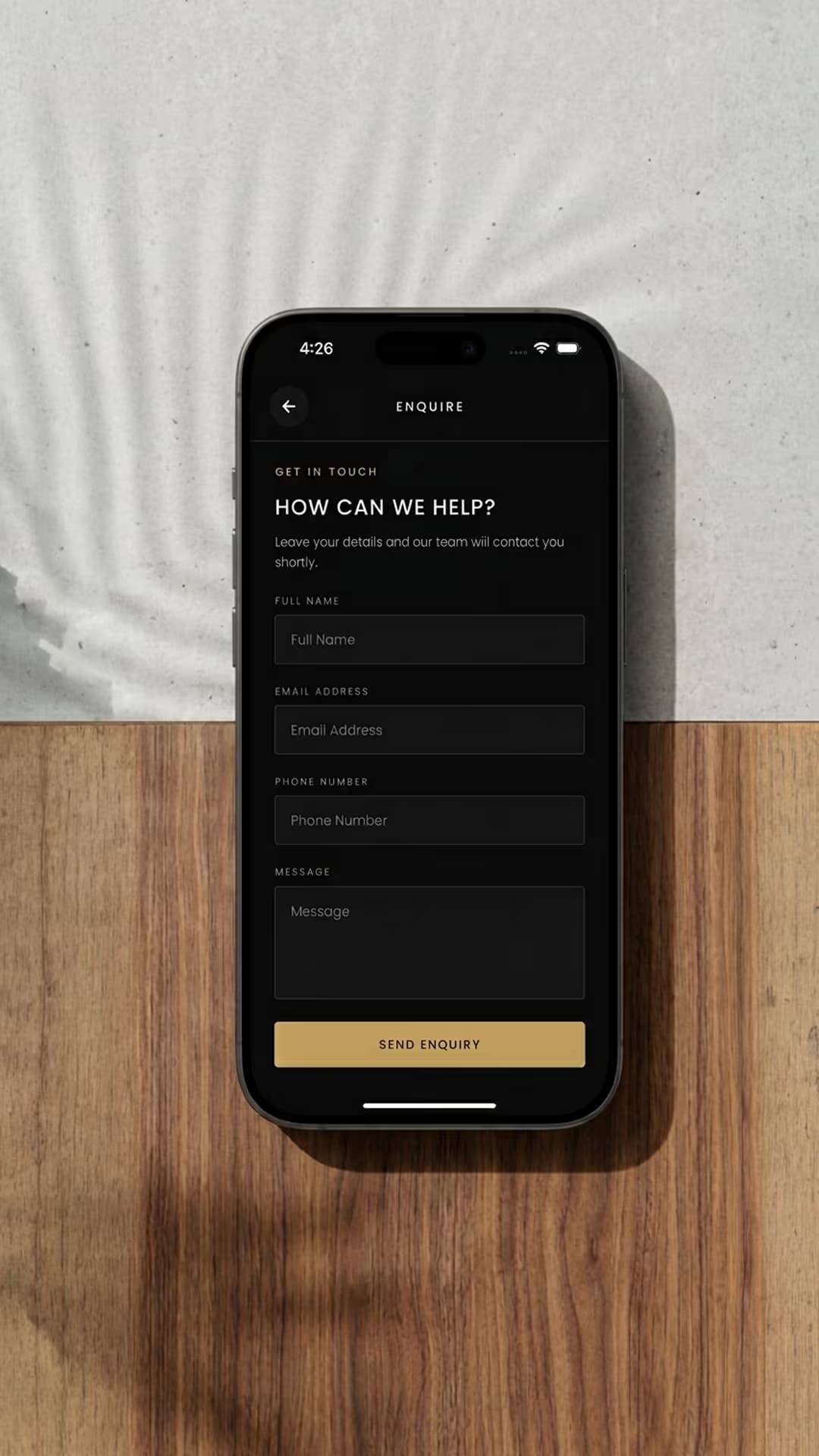 05 / 05Enquire
Four fields, and nothing else.
Design decisions
An account is offered, not demanded.
The first decision is whether to make anyone sign in at all. Most first visits to a property app are browsing, not buying, so a wall in front of the developments loses the people it is meant to qualify. Continue as guest sits directly under the login button, at the same weight: an account is offered, not demanded.
One development leads, not a grid.
A single featured development leads, not a grid. One building with its location, unit mix and size range answers more than six thumbnails do, and Enquire Now and Call Us Now sit on the card itself rather than behind a menu, so the two actions a serious buyer wants are never more than one tap from what they are looking at.
The full portfolio, one card per building.
The full portfolio, one card per development, each carrying its own entry price. Price on the card rather than behind a tap is deliberate: it filters early, which costs some browsing and produces better enquiries. The same three developments the launch pages cover, so nothing contradicts the website.
A slide-over, not a tab bar.
Developments, investments, the LEOS Hub and news, as a slide-over rather than a tab bar, because five destinations of uneven importance do not divide well into equal tabs. Log out sits at the bottom in the accent colour, visible rather than buried in a settings screen two levels down.
Four fields, and nothing else.
Name, email, phone and a message. Every extra field on a property enquiry costs completions, and the ones that matter for a first conversation are how to reach someone and roughly what they want. Qualification happens on the call, not in the form. It is reachable from every development card, so nobody has to navigate back to a contact page to act on what they are looking at.
The approach
Design and build were the same job here, done in this order:
Design
- Interface design for the screens shown here
- Platform-appropriate navigation: slide-over rather than a tab bar
- Sign-in that offers an account without requiring one
Build
- React Native, one codebase for iOS and Android
- Shared components across every screen
- Development data matched to the website, so the two cannot drift
Enquiry path
- Four-field enquiry form, reachable from every development card
- Enquire and call actions on the content rather than behind a menu
What it changed.
1
Codebase for both platforms
One component tree to build, fix and maintain, rather than two.
Enquiries per month from the app and Time to first response are deliberately absent. One figure a client can verify is worth more than three they cannot, so nothing goes here until the number is real.
Next case study
About this app
Why one codebase instead of separate iOS and Android apps?
Economics. Two native codebases means writing, testing and maintaining every screen twice, which for a business app of this kind buys very little a buyer would notice. React Native gives iOS and Android from one build. Where an app genuinely needs platform-specific native work I say so rather than take the project.
Who designed the screens, and who built them?
The same person, which is the point. The interface was designed and then built by me, so the reasoning behind a screen and its implementation match instead of one having been handed across to the other and interpreted.
Are these real screens or concepts?
Real. Every capture on this page is from the built app rather than a mockup, which is why the walkthrough talks about decisions that had to survive contact with real content: long development names, missing photography, and units that change availability.
Why does the app repeat what the website already does?
It does not repeat it, it continues it. The app carries the same developments, the same photography and the same enquiry routes as the launch pages, so a buyer who first saw a campaign on their laptop finds the same thing on their phone rather than a second, thinner version of it.
Can you take an app like this through App Store review?
Submission is a step I can run with you, and it is worth planning early because store review is the part of a launch date nobody controls. No published listing is claimed for this app here, because that announcement belongs to the client.
The disciplines this work is made of
Have a project in mind? Let's start it.
Whether it's a paid campaign, a website or app, or ongoing design and social support, tell me what you need and I'll get back to you with next steps.