

A website for a textile chemicals manufacturer: 87 products, eight ranges, one route to a sample
- Client
- Texdale Chemicals
- Scope
- Strategy, UX, UI, build
- Stack
- Next.js
- Catalogue
- 87 products, 8 ranges
- Live
- texdale.co.uk
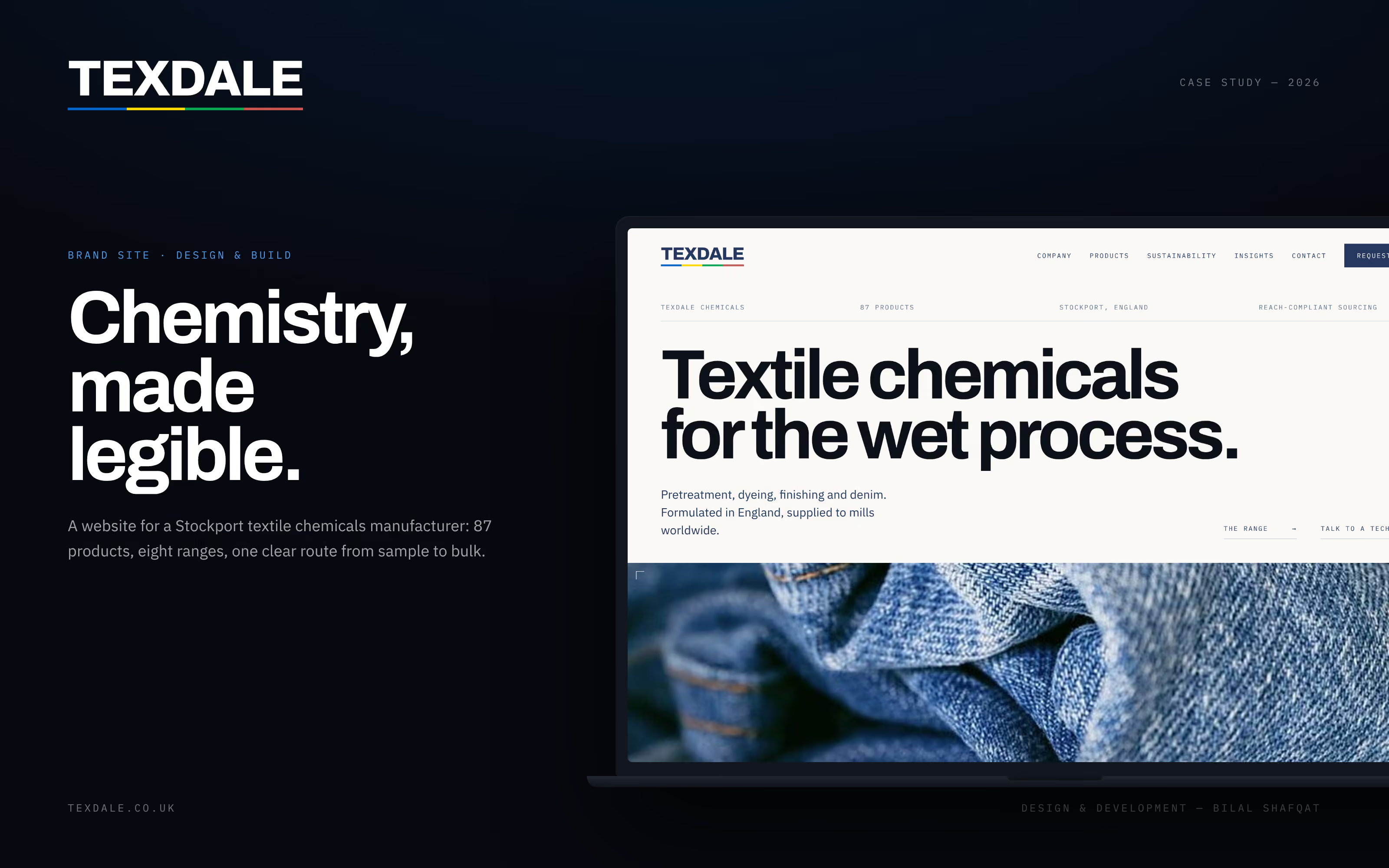
Website design for a textile chemicals manufacturer
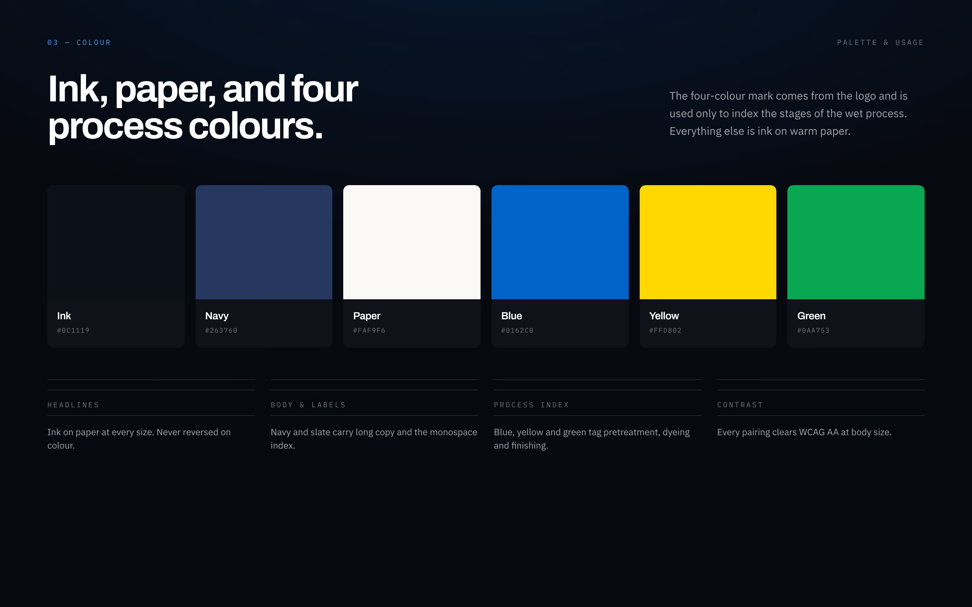
Texdale makes textile auxiliaries in Reddish, Stockport, for every wet stage a mill runs: pretreatment, dyeing, finishing and denim washing. Its customers are spread across several continents, its catalogue holds 87 products in eight ranges, and the person reading the website is usually a dyehouse or finishing technician.
That buyer does not need persuading that chemistry matters. They need to find the right product, trust the company behind it and ask for a sample. So the site was built to be read quickly and trusted at once: a technical grid, monospace labels and a short route from any range to a sample request. Strategy, UX, UI and the Next.js build were done by one person.
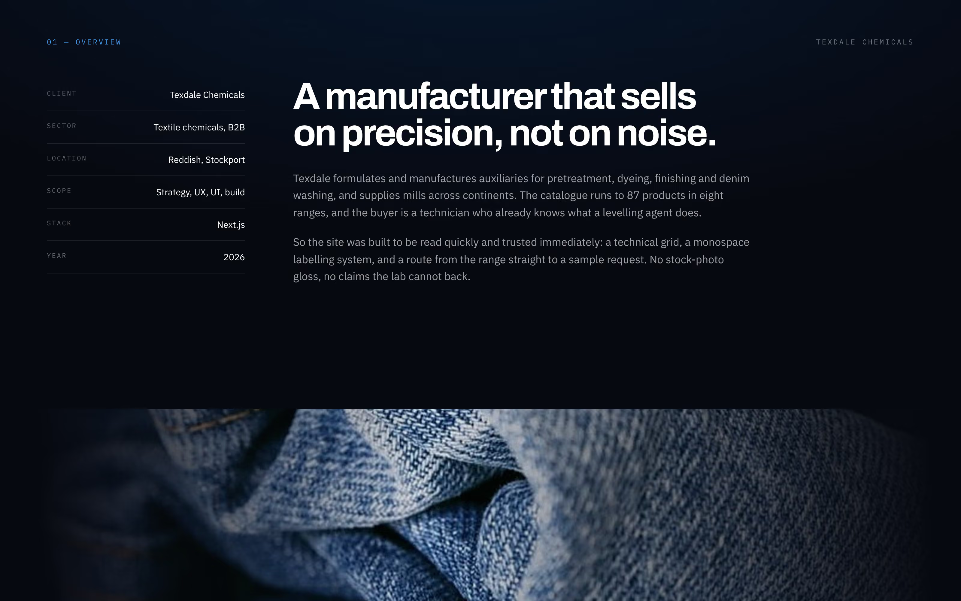
A B2B website project in four phases
The work ran in four phases, and each one ended with something the client could check: a product map, a sitemap, a clickable prototype and a live site.
Discovery covered a product audit and a competitor scan. Structure mapped all 87 products into eight ranges and set the navigation and sitemap. Design produced the type system, colour, components and prototype. Build and launch delivered the Next.js site with its SEO, forms and handover notes. The test for success was simple: a technician finds the right auxiliary and requests a sample in under a minute.
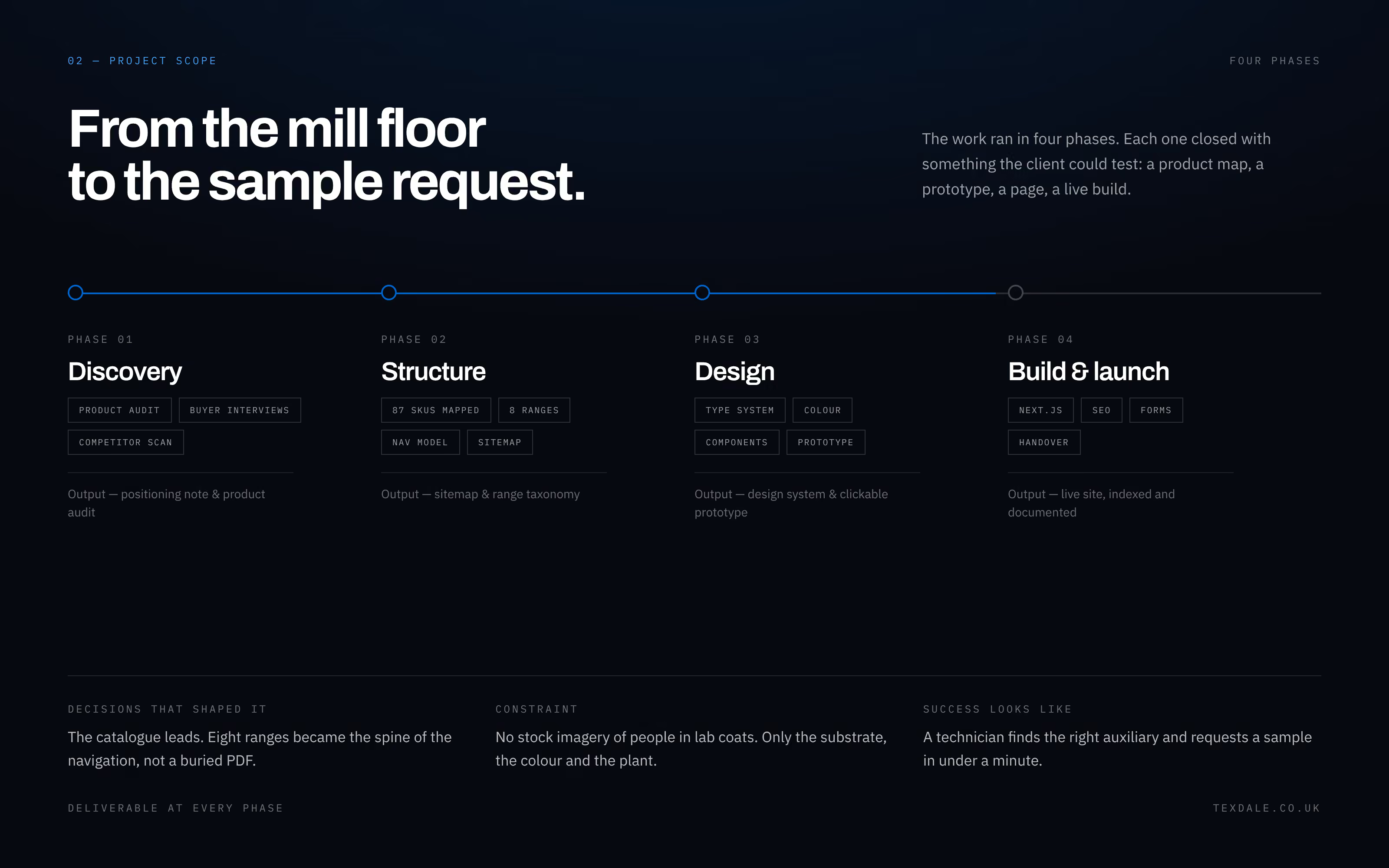
A brand colour system built from the logo
Texdale's logo carries a four-colour bar under the wordmark. The site keeps that bar but gives it one job: blue, yellow and green index the stages of the wet process, pretreatment, dyeing and finishing, so a colour always means a place in the process.
Everything else is ink on warm paper, with navy and slate for long copy and labels. Six colours in total: ink #0C1119, navy #263760, paper #FAF9F6, blue #0162C8, yellow #FFD802 and green #0AA753. A small palette like this keeps a technical site calm and makes the coloured parts mean something.
Typography for a technical catalogue
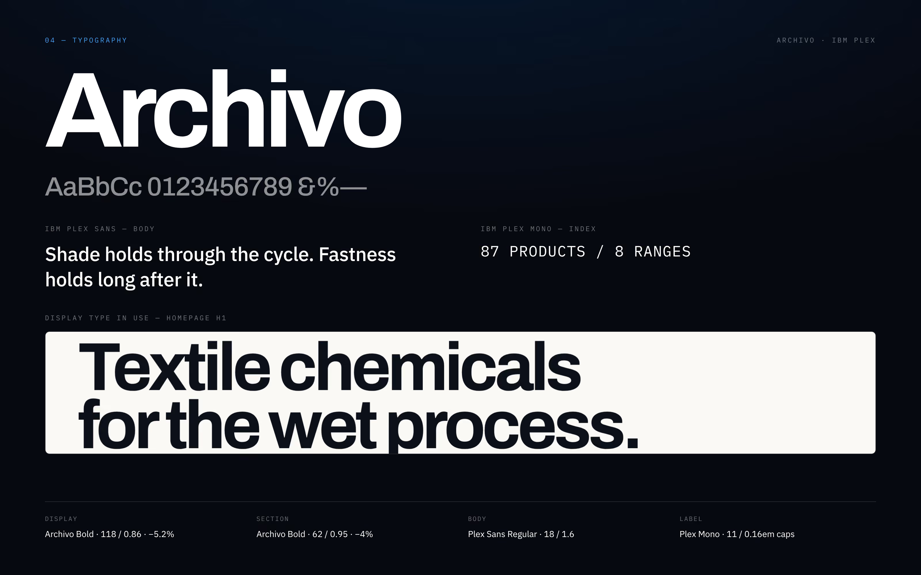
Three typefaces, each with a clear role. Archivo Bold sets the display headlines, large and tightly spaced, so the homepage opens with a statement a buyer cannot miss. IBM Plex Sans carries the body copy at 18px for easy reading. IBM Plex Mono labels and numbers every section, product count and range.
The monospace index is what makes the site read like a technical document, which is the kind of page this buyer already trusts. All the fonts are self-hosted, so they load with the page rather than from a third party.
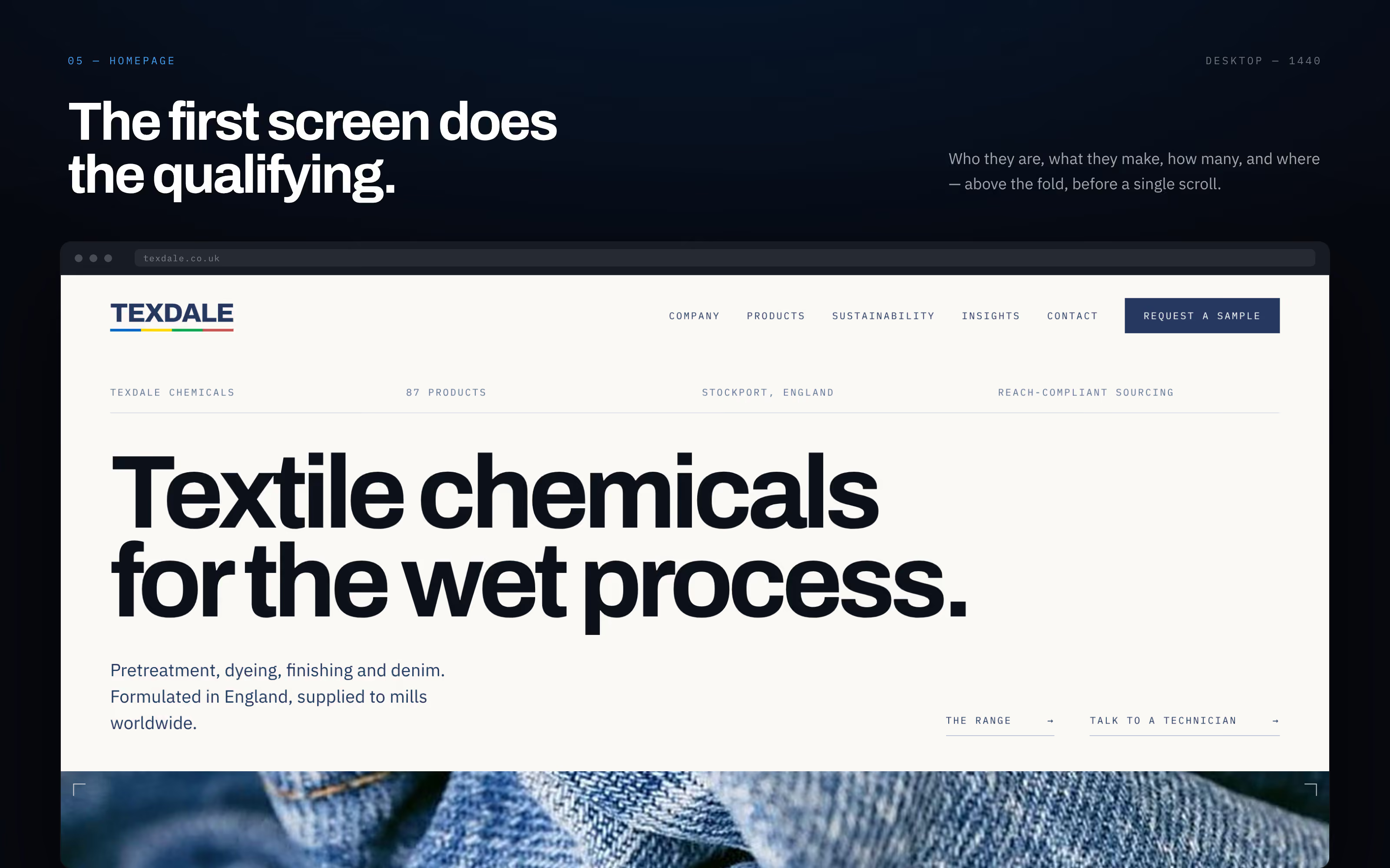
A homepage that qualifies the buyer on the first screen
Before anyone scrolls, the first screen answers four questions: who Texdale is, what it makes, how many products, and where. A strip of facts reads Texdale Chemicals, 87 products, Stockport, England, and REACH-compliant sourcing. The headline says Textile chemicals for the wet process.
Two routes sit under it, The range and Talk to a technician, and Request a sample stays in the header on every page. A buyer who is in the right place knows it in seconds. One who is not leaves quickly, which is also useful.
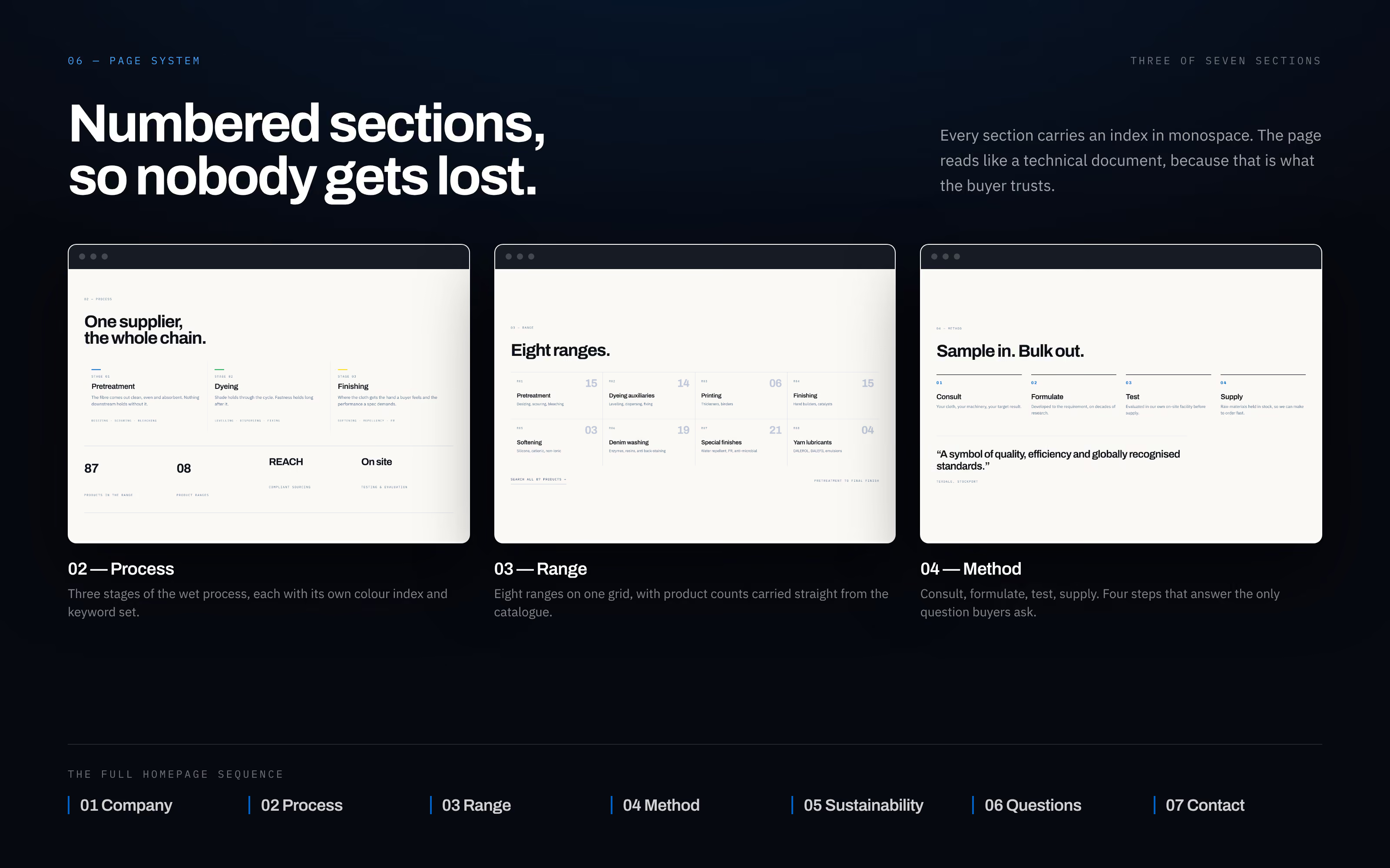
Numbered sections, so nobody gets lost
The homepage runs in seven numbered sections: Company, Process, Range, Method, Sustainability, Questions and Contact. Each carries its number in monospace, so the page can be scanned like a contents list.
Process sets out the three stages of the wet process, each with its own colour. Range shows the eight ranges on one grid with product counts taken straight from the catalogue. Method explains the four steps a buyer actually goes through: consult, formulate, test and supply.
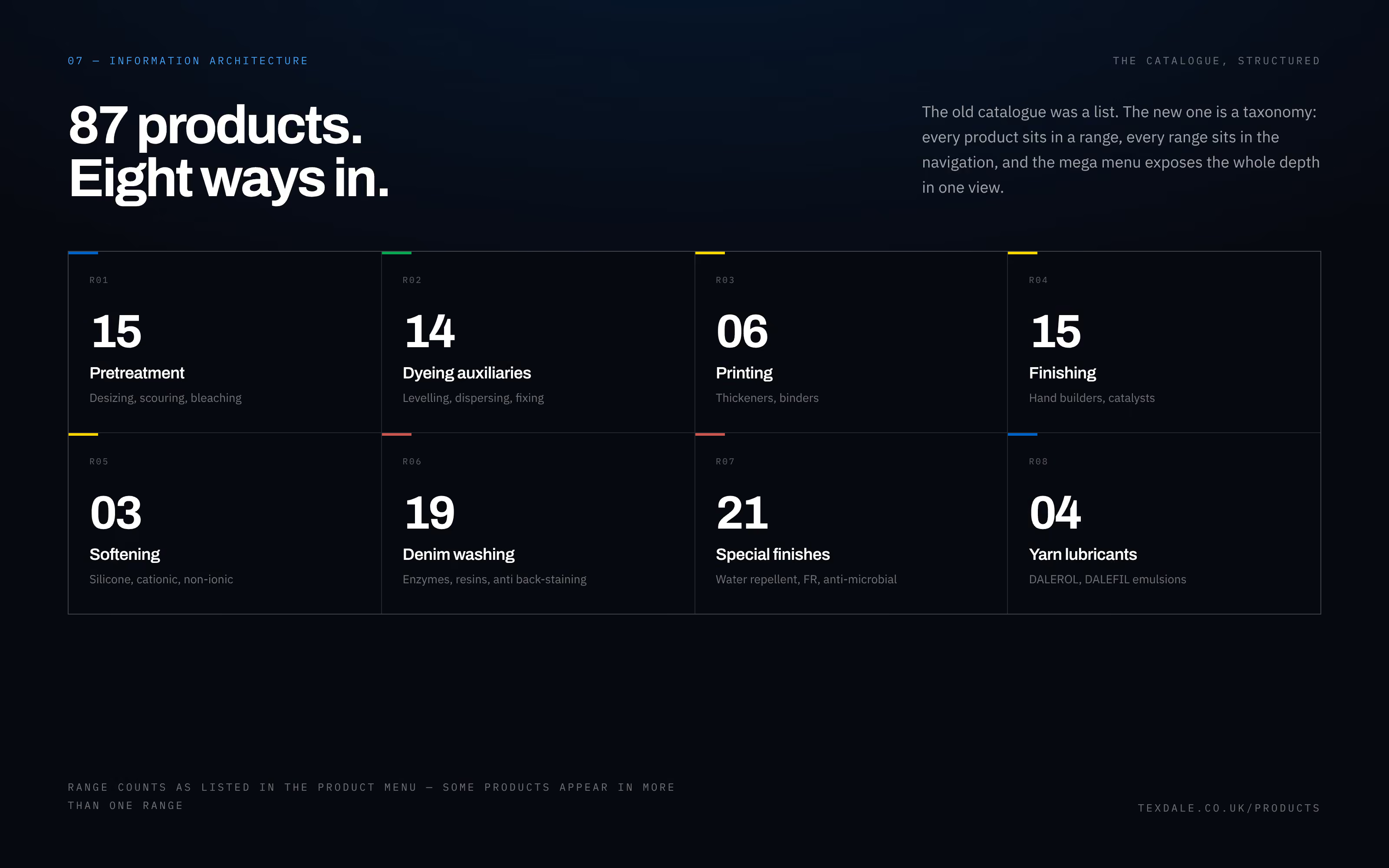
Product catalogue structure: 87 products, eight ways in
The old catalogue was a list. The new one is a structure: every product sits in a range, every range sits in the navigation, and a mega menu shows the whole catalogue in one view.
The eight ranges are Pretreatment, Dyeing auxiliaries, Printing, Finishing, Softening, Denim washing, Special finishes and Yarn lubricants. The counts come from the product menu, and some products appear in more than one range, because a mill looks for a product by the job it does. For a manufacturer, this structure matters more than any single page design. It decides whether a buyer finds the product at all.
Mobile website design for a mill floor
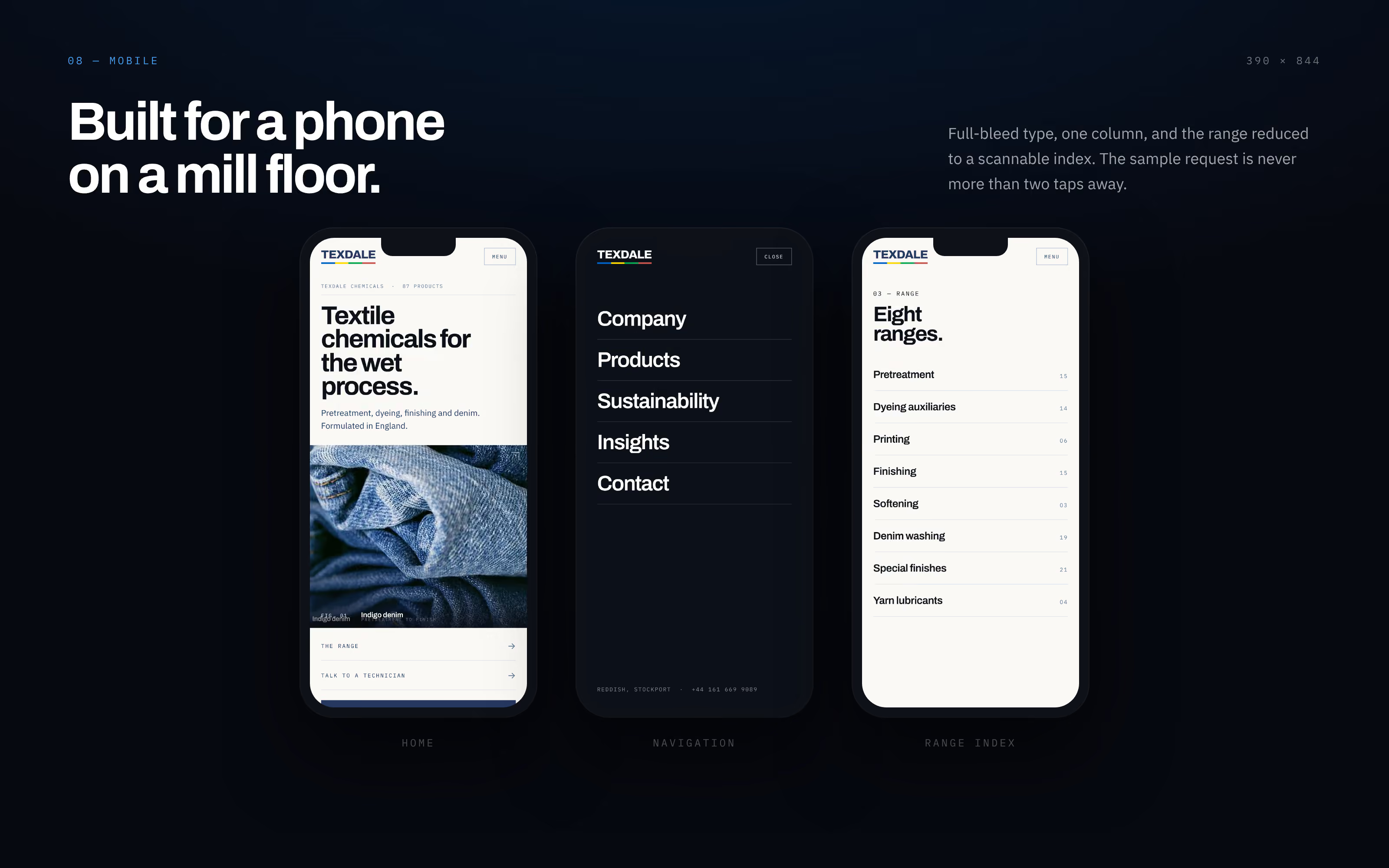
Many of Texdale's buyers check a product on a phone, often standing next to the machine. On a phone the site becomes one column with full-width type, and the range turns into a short index with the product count beside each name.
The menu opens to five large links: Company, Products, Sustainability, Insights and Contact. From any range, a sample request is never more than two taps away.
Mega menu, FAQ accordion and enquiry form
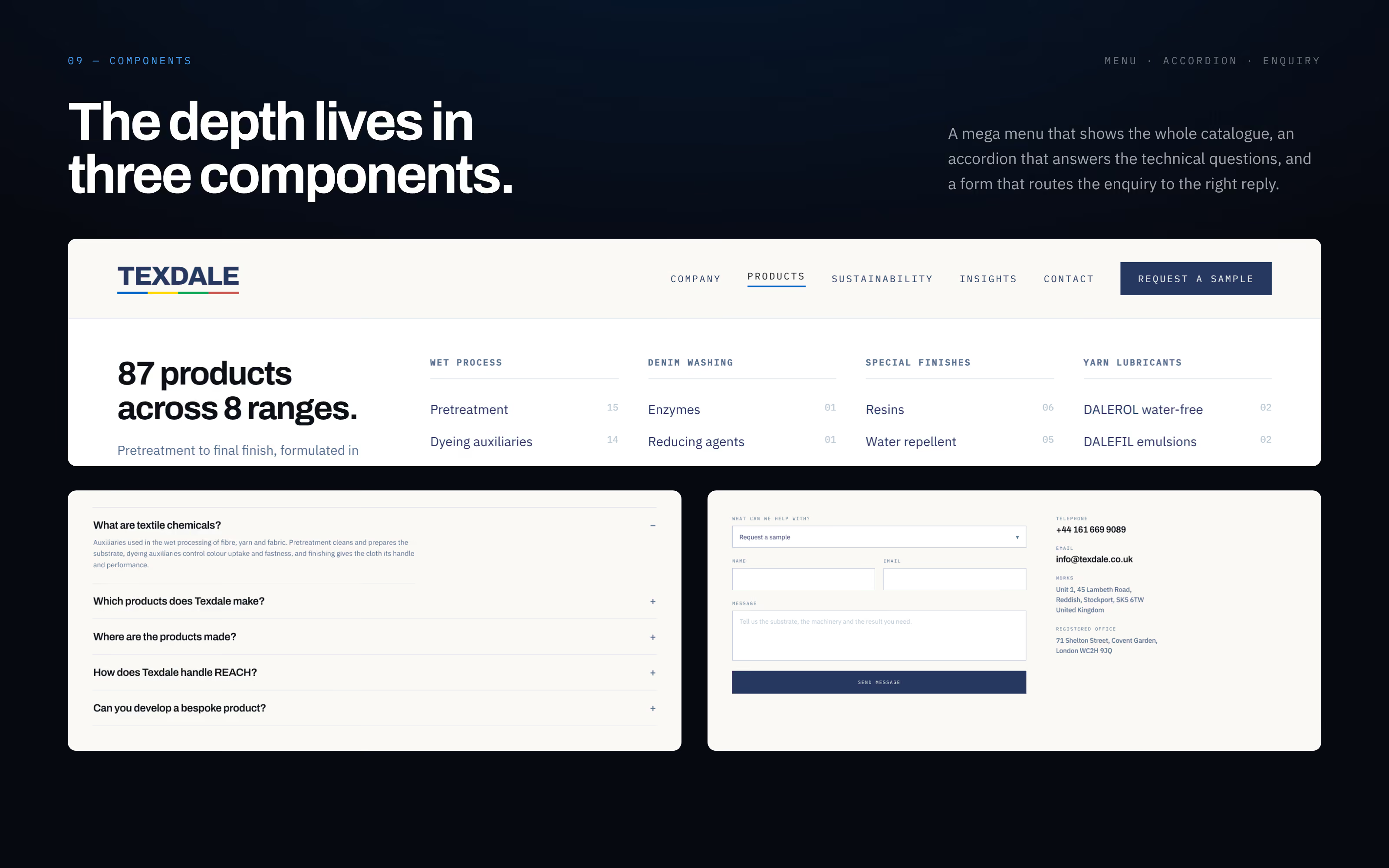
Most of the site's depth lives in three components. The mega menu shows all 87 products across eight ranges under four headings: wet process, denim washing, special finishes and yarn lubricants. The FAQ accordion answers the questions technicians ask before they get in touch, such as what textile chemicals are, where the products are made and how Texdale handles REACH.
The enquiry form asks first what the visitor needs: a quote, a sample, a technical data sheet, a safety data sheet or a general question. Each request arrives labelled, so the reply comes from the right technician with the right document.
A catalogue that finally behaves like one
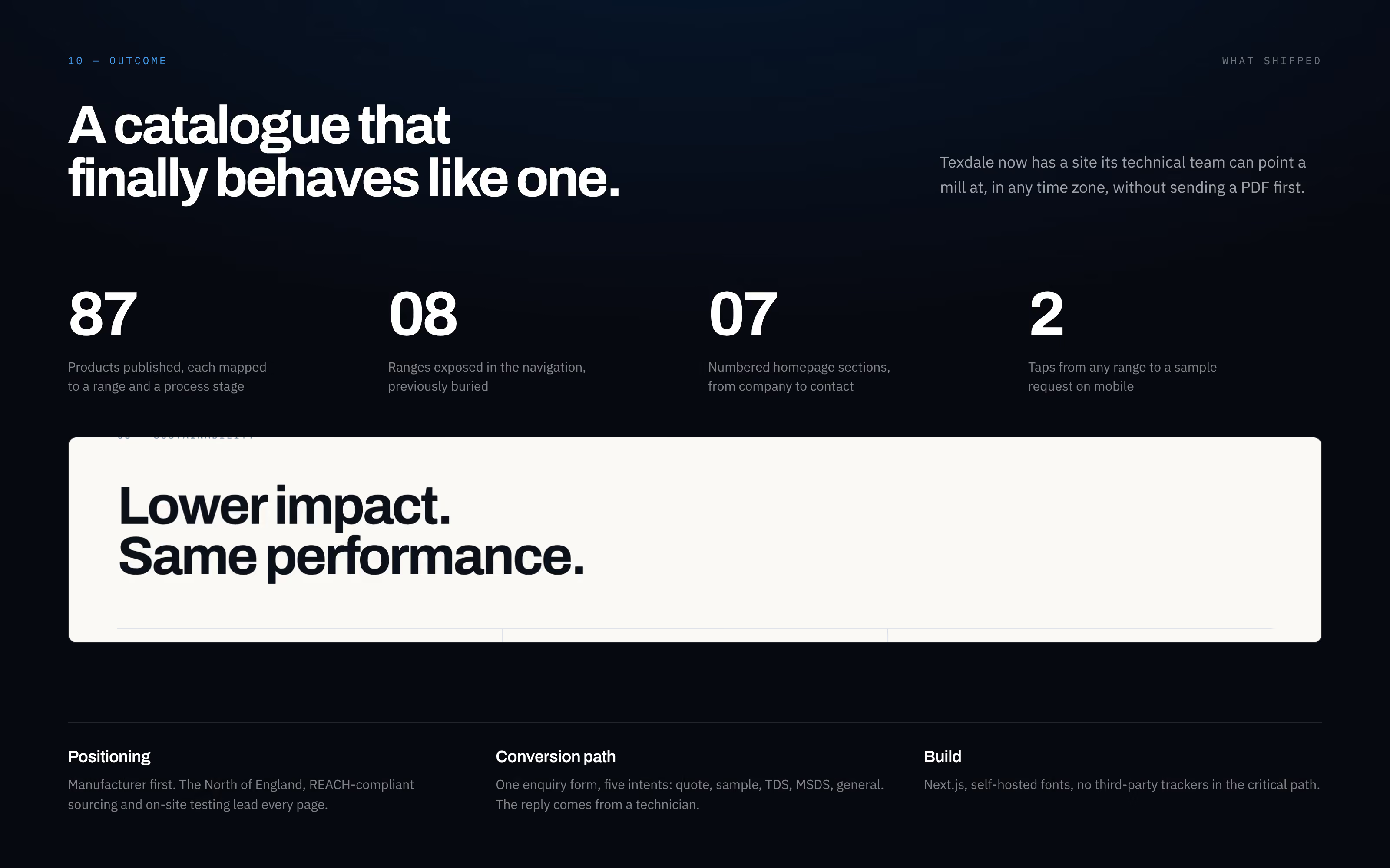
What shipped: 87 products published, each mapped to a range and a process stage; eight ranges in the navigation that were previously buried; seven numbered homepage sections; and a sample request two taps from any range on mobile. Texdale's technical team can now send a mill to the website, in any time zone, without sending a PDF first.
The site is also the base for the rest of the marketing. The Google and Meta campaigns, SEO and AI search work all point at these pages, so the ads, the search results and the website describe one company in the same words.
Got a catalogue nobody can read?
I design and build websites for manufacturers and B2B companies, where the product list is the hard part. One person from the first sketch to the live site, and the campaigns after it.
About this website
How is the Texdale product catalogue organised?
87 products in eight ranges: Pretreatment, Dyeing auxiliaries, Printing, Finishing, Softening, Denim washing, Special finishes and Yarn lubricants. Every range is in the navigation, a mega menu shows the whole catalogue in one view, and some products sit in more than one range because mills search by the job a product does.
What should a website for a chemical manufacturer do?
Help a technical buyer find the right product and ask for a sample quickly. For Texdale that meant a first screen that says who, what, how many and where, a catalogue structured by range and process stage, data sheets close to every product, and an enquiry form that asks first whether the visitor wants a quote, a sample, a TDS, an SDS or a general answer.
How was the Texdale website project run?
In four phases, each ending with something the client could check: discovery (product audit and competitor scan), structure (87 products mapped to eight ranges, navigation and sitemap), design (type, colour, components and a clickable prototype) and build and launch (Next.js, SEO, forms and handover).