

One brand system for a textile chemicals manufacturer, from the website to the ads
- Client
- Texdale
- Starting point
- Texdale's wordmark and colour bar
- Palette
- 6 colours
- Type
- Archivo, IBM Plex Sans, IBM Plex Mono
- Used on
- Website, app, Meta ads
One identity across the website, the app and the ads
Texdale came with its own identity: a navy wordmark with a four-colour bar under it. The work was to turn that mark into a system that every channel could use, so the website, the Texdale Field app and the Meta campaign all look like the same company.
The system sets the colours, the typefaces and the layout rules, and gives each one a single job. A buyer who sees an ad, opens the website and later uses the app should never wonder whether they are dealing with the same supplier.
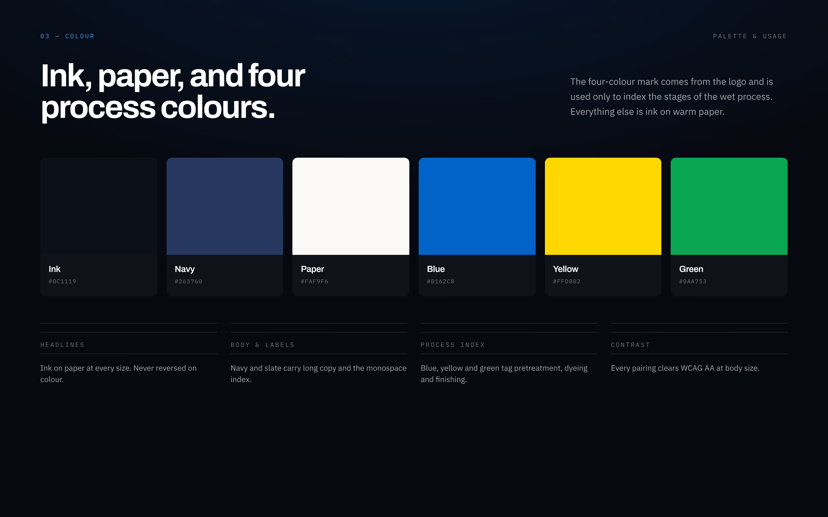
Four colours from the logo, each with one meaning
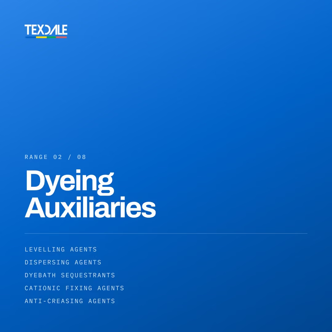
The four-colour bar under the wordmark became the process index. Blue, yellow and green mark pretreatment, dyeing and finishing wherever they appear, on the website, in the app and on the range creatives, so a colour always means a stage of the wet process.
Everything else is ink on warm paper, with navy and slate for long copy and labels: ink #0C1119, navy #263760, paper #FAF9F6, blue #0162C8, yellow #FFD802 and green #0AA753. Keeping the palette this small is what lets the coloured parts carry meaning.
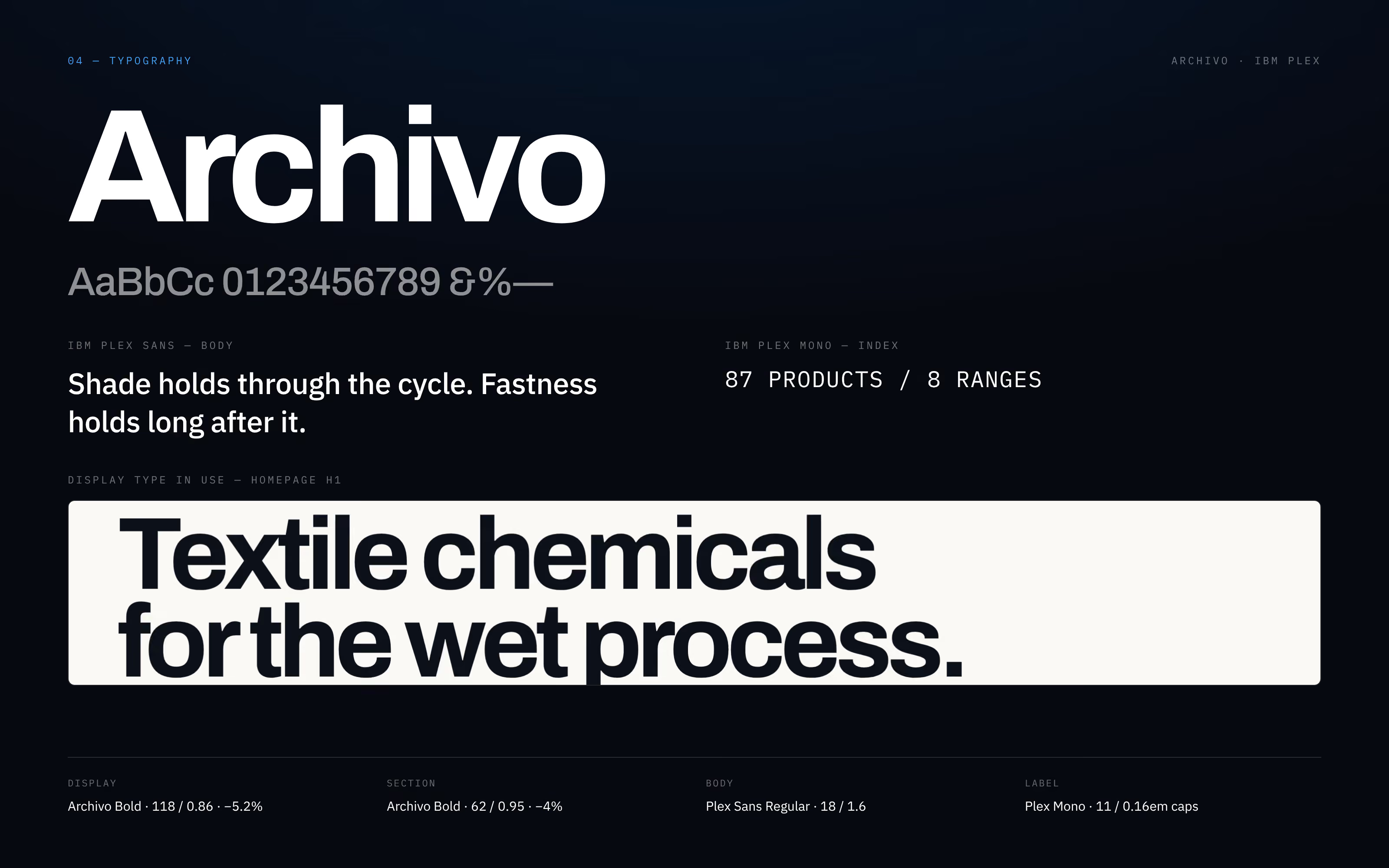
Three typefaces, each with a clear role
Archivo Bold sets the headlines, large and tightly spaced. IBM Plex Sans carries the body copy for easy reading. IBM Plex Mono labels and numbers sections, ranges and product counts, which gives the brand the feel of a technical document, the kind of page a dyehouse technician already trusts.
The same three faces run through the website, the app screens and the social creatives, so the type alone tells a buyer whose material they are looking at.
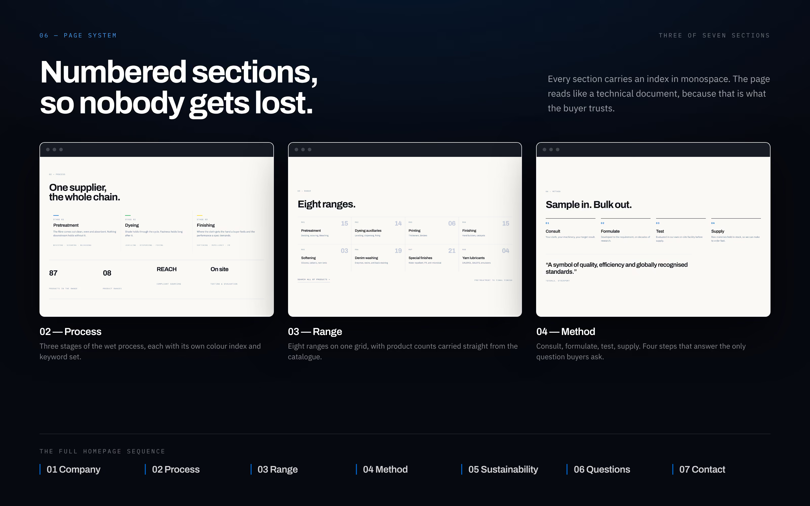
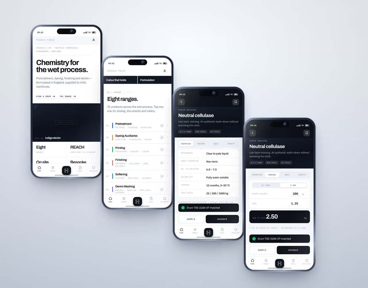
The same brand in the app and on social
The Texdale Field app uses the same wordmark, colours and type as the website, at a phone's scale. The Meta campaign creatives do the same: a brand creative and one for each of the eight product ranges, each carrying its range number and its process colour.
For a B2B manufacturer this consistency is not decoration. Technical buyers judge a supplier on precision, and a brand that looks the same everywhere reads as a company that is careful about details. See the website, the app design and the social media work in full.
About this brand system
What fonts and colours does the Texdale website use?
Archivo Bold for headlines, IBM Plex Sans for body copy and IBM Plex Mono for labels and numbers, all self-hosted. The palette is ink, navy and warm paper, with blue, yellow and green from the logo used only to mark pretreatment, dyeing and finishing.
How do you keep a B2B brand consistent across the website, app and ads?
Write the rules down once and give each part one job. For Texdale the colours from the logo mark the three stages of the wet process and nothing else, three typefaces each have a fixed role, and the same rules are applied to the website, the Texdale Field app and every Meta creative. A buyer then sees one company wherever they meet it.
What is a brand system?
The rules that make every channel look like one company: which colours to use and what each one means, which typeface does which job, and how layouts are built. For Texdale it starts from the wordmark and four-colour bar and is applied the same way to the website, the Texdale Field app and the Meta ads.