One identity for a textile chemicals manufacturer, from the website to the ads
- Client
- AKS Chemicals
- Starting point
- The AKS logo
- Palette
- 6 colours
- Type
- Newsreader, Inter, JetBrains Mono
- Used on
- Website, Meta ads, social
One identity across the website and the ads
The site's identity is built on the AKS logo: the brand navy taken from the mark, a warm dye-orange accent, dark ink and bone sections, and a serif display face. The work was to turn that into a system every channel could use, so the website, the social posts and the Meta campaign all look like the same company.
The system sets the colours, the typefaces and the layout rules, and gives each one a single job. A buyer who sees an ad, opens the website and later checks a profile should never wonder whether it is the same supplier.
Dark, not clinical
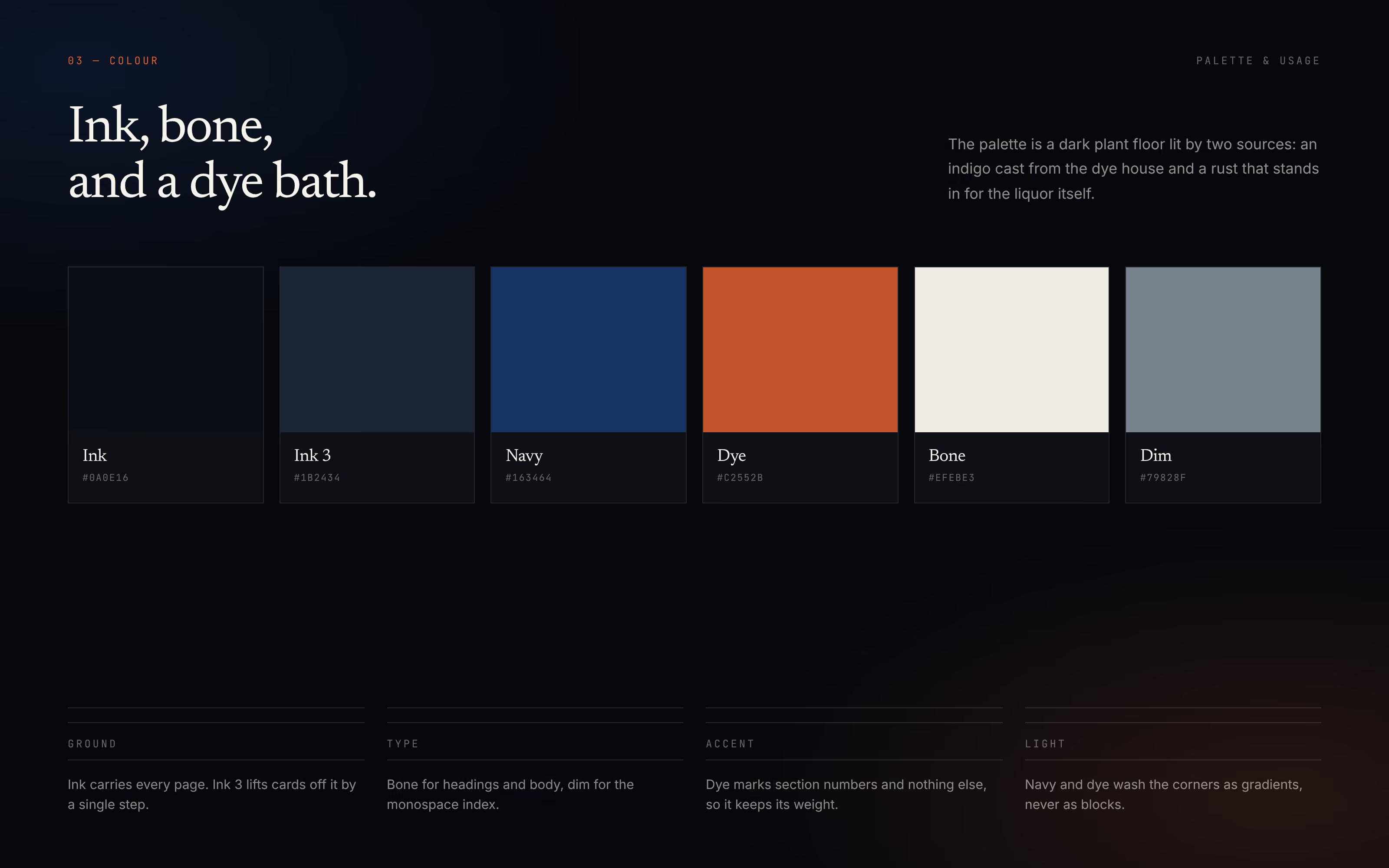
Competitors in textile chemicals tend to sell white laboratories. AKS sells a plant that runs, so the palette is a dark plant floor lit by an indigo cast from the dye house and a rust that stands in for the dye liquor.
Each colour has one job: ink carries every page, a second ink lifts cards, bone is for reading, dim grey is for the index, and the rust marks section numbers and nothing else. The palette is ink #0A0E16, ink 3 #1B2434, navy #163464, dye #C2552B, bone #EFEBE3 and dim #79828F.
Three typefaces, each with a clear role
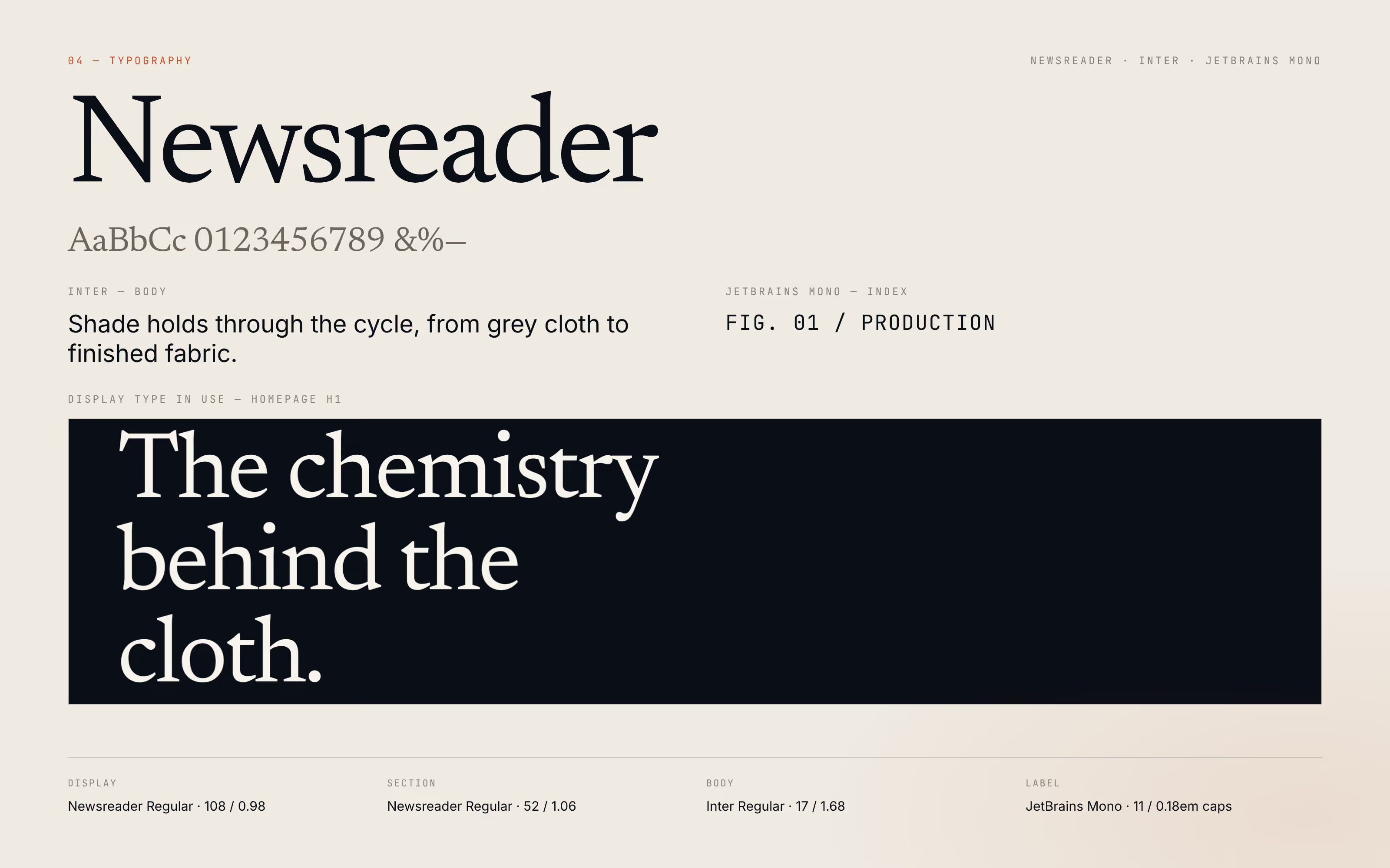
Newsreader sets the headlines and gives the brand the authority of a company that has done this since 1987. Inter carries the body copy for easy reading. JetBrains Mono labels figures, sections and photographs in small spaced capitals, which gives the brand the precision a technical buyer looks for.
The same three faces run through the website and the social creatives, so the type alone tells a buyer whose material they are looking at.
The same brand on social and in the Meta ads
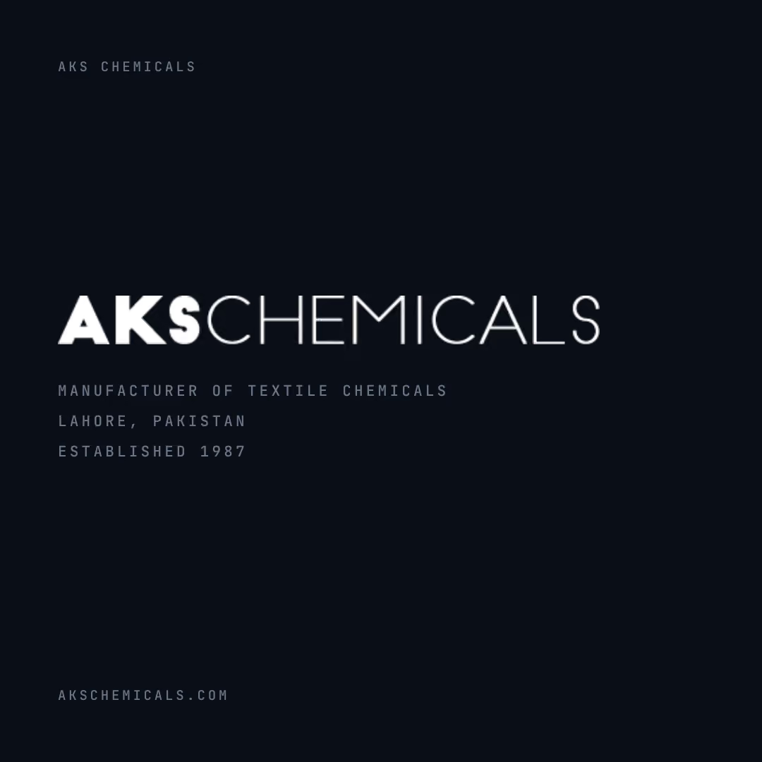
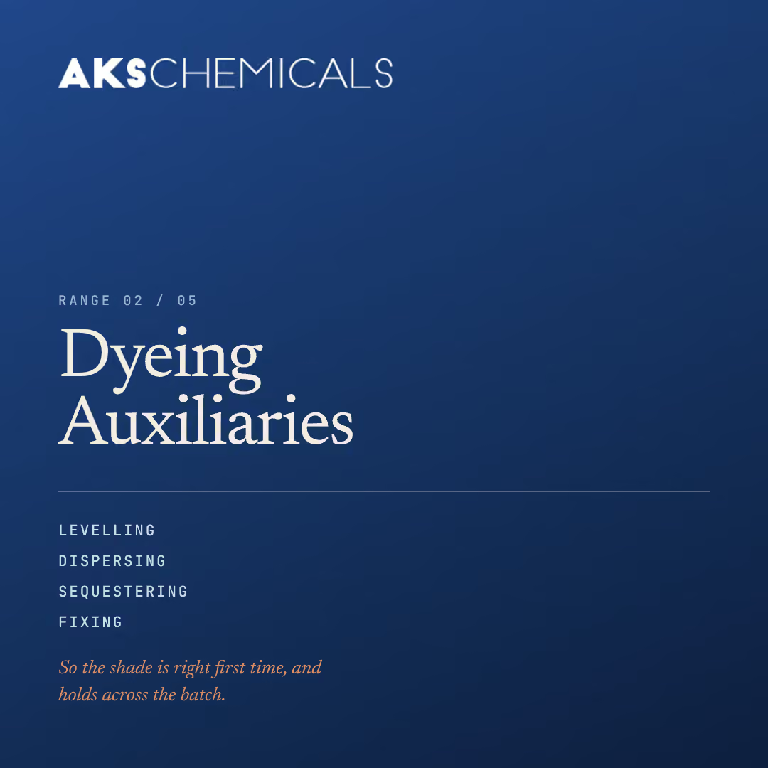
The nine Meta campaign creatives use the same wordmark, colours and type as the website: one for the brand, one for each of the five ranges, and one each for toll manufacturing, standards and the markets beyond textiles.
For a B2B manufacturer this consistency is not decoration. Technical buyers judge a supplier on precision, and a brand that looks the same everywhere reads as a company that is careful about details. See the website and the social media work in full.
About this brand system
What fonts and colours does the AKS Chemicals website use?
Newsreader for headlines, Inter for body copy and JetBrains Mono for labels and figures. The palette is dark ink with bone text, a navy from the logo, and a rust dye colour used only for section numbers.
Why does the AKS website use a dark design?
Most textile chemicals suppliers present white, clinical laboratories. AKS sells a working plant, so the site is a dark plant floor lit by an indigo dye-house cast and a rust accent, which sets it apart and suits its own photography.
How do you keep a B2B brand consistent across the website and ads?
Write the rules down once and give each part one job. For AKS each colour has a fixed role, three typefaces each have a fixed role, and the same rules are applied to the website and every Meta creative, so a buyer sees one company wherever they meet it.