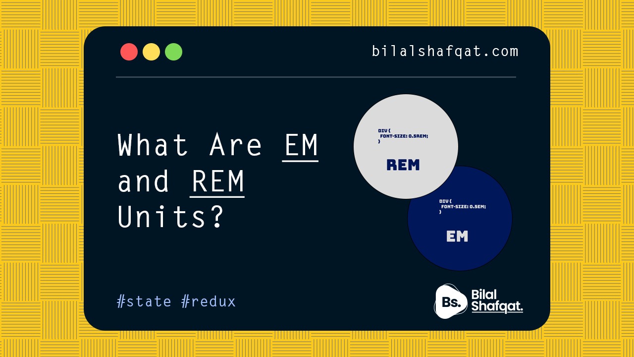
What Are EM and REM Units?
- bilalshafqat42
- January 24, 2025
- Blog, UI UX Design
- 1 Comment
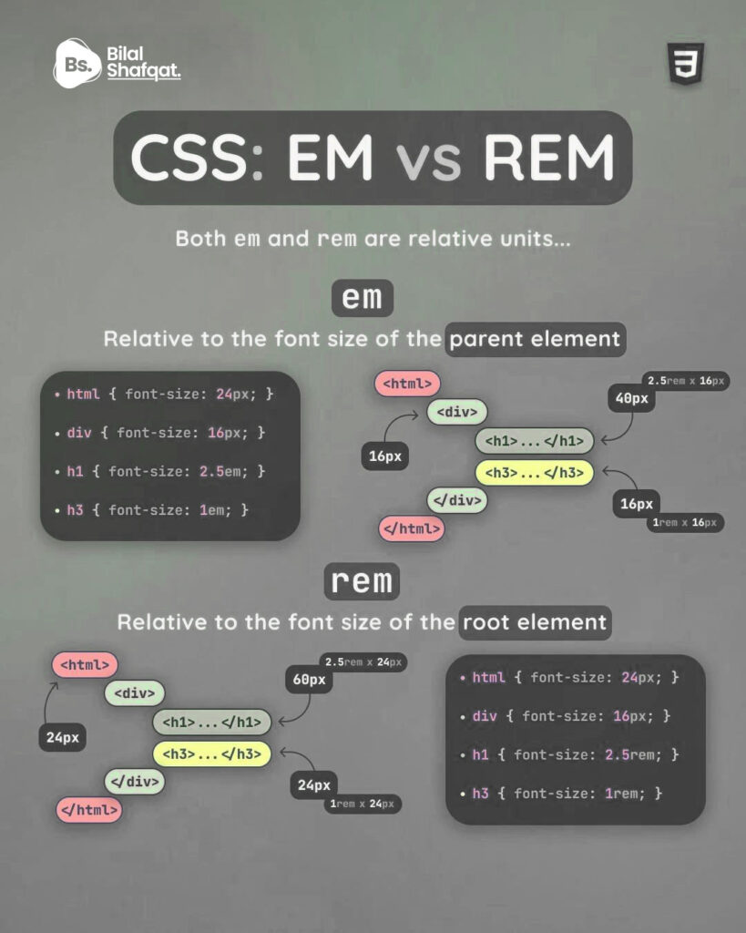
CSS uses various units to define lengths, such as px (pixels), % (percentages), and relative units like em and rem. Unlike absolute units like pixels, EM and REM are relative units, meaning their values depend on other elements in the document.
- EM (Relative to Parent Element): EM units are relative to the font size of the element’s parent. For instance, if the font size of the parent is
16pxand you set an element’s font size to2em, the resulting size will be2 * 16px = 32px. The EM unit cascades, meaning its value is affected by the parent element’s computed font size. - REM (Relative to Root Element): REM, short for “Root EM,” is always relative to the font size of the root element (
<html>). For example, if the root element’s font size is16px, setting an element’s font size to2remwill result in2 * 16px = 32px, regardless of its parent element.
Key Differences Between EM and REM
- Reference Point:
- EM depends on the font size of its immediate parent element.
- REM always references the root element’s font size.
- Cascading Behavior:
- EM values are influenced by their parent’s computed styles, which can result in compounding effects.
- REM values remain consistent across the document, making them more predictable.
- Use Cases:
- EM is useful when you want sizes to adjust based on their context (e.g., within a specific container).
- REM is ideal for creating a consistent design system where sizes scale uniformly.
Why Use Relative Units Instead of Pixels?
Using relative units like EM and REM provides several benefits:
- Scalability: Relative units make it easier to create responsive designs that adapt to different screen sizes and resolutions.
- Accessibility: Users with visual impairments often adjust their browser’s default font size. Relative units ensure your design scales proportionally without breaking.
- Maintainability: By defining sizes relative to a single root value, you can change the entire site’s scale by updating the root font size.
Practical Examples
1. Using EM for Nested Elements
/* Base font size */
body {
  font-size: 16px;
}

/* Parent element */
.container {
  font-size: 1.5em; /* 1.5 * 16px = 24px */
}

/* Child element */
.container .child {
  font-size: 2em; /* 2 * 24px = 48px */
}
In this example, the child element’s font size is calculated based on its parent (.container), resulting in cascading effects.
2. Using REM for Consistency
/* Base font size */
html {
  font-size: 16px;
}

/* Element sizes */
h1 {
  font-size: 2rem; /* 2 * 16px = 32px */
}

p {
  font-size: 1rem; /* 1 * 16px = 16px */
}
Here, all sizes reference the root element’s font size, ensuring a consistent scale throughout the site, regardless of the parent element.
3. Combining EM and REM
You can use both EM and REM strategically. For instance, you might use REM for typography to maintain consistency and EM for spacing within components for flexibility.
html {
  font-size: 16px;
}

.card {
  font-size: 1rem; /* 16px */
  padding: 2em; /* 2 * 16px = 32px, relative to the card's font size */
}

.card-title {
  font-size: 1.5rem; /* 1.5 * 16px = 24px, relative to the root */
}
This approach ensures predictable typography while allowing component-specific adjustments.
Common Pitfalls to Avoid
- Compounding with EM: Nesting multiple elements with EM can result in unintended scaling. Always test your designs to avoid unexpected sizes.
- Inconsistent Root Font Sizes: If you use REM units but don’t set a consistent root font size in your CSS, the browser’s default value (often
16px) will be used. Define a root font size for better control. - Mixing Pixels with Relative Units: Avoid mixing
pxwith EM or REM in the same context. This can create inconsistencies, especially in responsive designs.
When to Use EM vs. REM
- Use EM when:
- You want element sizes to depend on their parent container.
- Creating modular components where styles adapt to context.
- Use REM when:
- You want a consistent scale across your entire site.
- Defining global typography and spacing.
Tips for Mastering EM and REM
- Set a Base Font Size: Define a root font size in the
<html>element, e.g.,html { font-size: 16px; }. This provides a predictable starting point. - Leverage Browser Defaults: Most browsers use
16pxas the default font size. Use this to calculate your EM and REM values during development. - Test Responsiveness: Adjust your browser’s font size to ensure your design scales well with user preferences.
Conclusion
Understanding and effectively using EM and REM units can elevate your CSS skills and make your designs more flexible and user-friendly. While EM provides flexibility within components, REM ensures global consistency. By leveraging both units strategically, you can create responsive and accessible designs that scale beautifully across devices.
Start experimenting with EM and REM in your projects today, and you’ll quickly see the benefits of these powerful CSS tools. Happy coding!


registrera dig f"or binance
I don’t think the title of your article matches the content lol. Just kidding, mainly because I had some doubts after reading the article.