Mastering Flexbox in CSS: The Ultimate Guide for Responsive Web Design
- bilalshafqat42
- February 7, 2025
- CSS, Flexbox
- Css, Flexbox
- 0 Comments
What is Flexbox in CSS?
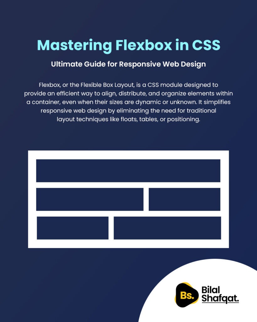
Flexbox, or the Flexible Box Layout, is a CSS module designed to provide an efficient way to align, distribute, and organize elements within a container, even when their sizes are dynamic or unknown. It simplifies responsive web design by eliminating the need for traditional layout techniques like floats, tables, or positioning.
With Flexbox, developers can create flexible, fluid, and scalable designs effortlessly. Whether you’re working on navigation menus, card layouts, or complex grids, Flexbox ensures that elements adjust dynamically to different screen sizes.
Why Use Flexbox?
✅ Simplifies layout design – No need for complex CSS hacks or float-based layouts.
✅ Supports responsive design – Adjusts elements dynamically based on screen size.
✅ Efficient space distribution – Evenly spaces elements inside a container.
✅ Better alignment options – Easily align elements both horizontally and vertically.
✅ Eliminates margin and padding issues – Prevents layout inconsistencies across browsers.
Understanding the Key Properties of Flexbox
To fully grasp the power of Flexbox, let’s break down its essential properties:
1. Flex Direction
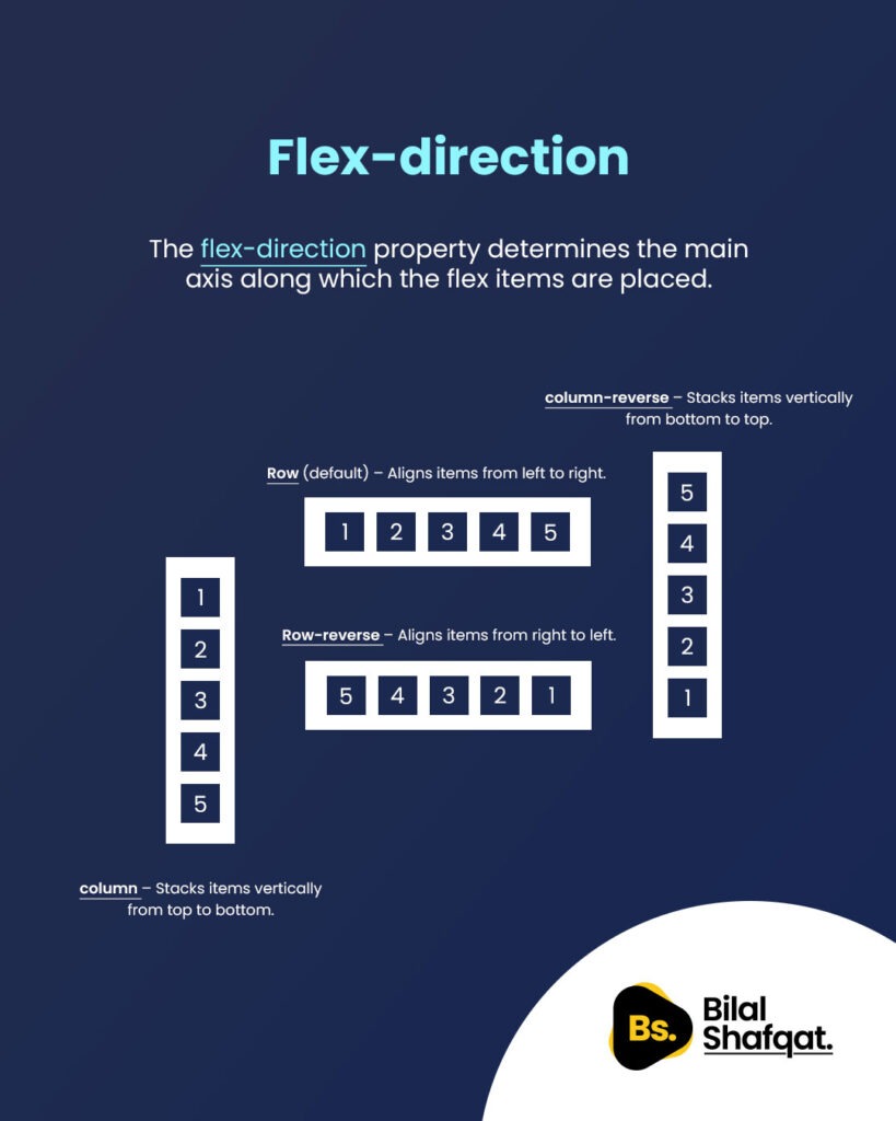
The flex-direction property determines the main axis along which the flex items are placed. It can be set to:
row(default) – Aligns items from left to right.row-reverse– Aligns items from right to left.column– Stacks items vertically from top to bottom.column-reverse– Stacks items vertically from bottom to top.
Example:
.container {
    display: flex;
    flex-direction: row; /* Change to column, row-reverse, or column-reverse */
}
2. Justify Content

The justify-content property defines how flex items are aligned along the main axis (horizontal for row, vertical for column). It supports the following values:
flex-start– Aligns items to the start of the container.flex-end– Aligns items to the end of the container.center– Centers items horizontally.space-between– Distributes items with space between them.space-around– Places equal space around each item.space-evenly– Ensures equal spacing between items.
Example:
.container {
    display: flex;
    justify-content: center; /* Try space-between, space-around, etc. */
}
3. Align Items
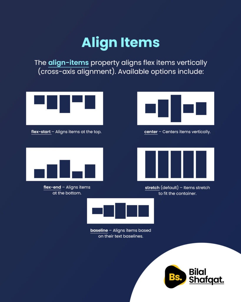
The align-items property aligns flex items vertically (cross-axis alignment). Available options include:
stretch(default) – Items stretch to fit the container.flex-start– Aligns items at the top.flex-end– Aligns items at the bottom.center– Centers items vertically.baseline– Aligns items based on their text baselines.
Example:
.container {
    display: flex;
    align-items: center; /* Change to flex-start, flex-end, etc. */
}
4. Flex Basis
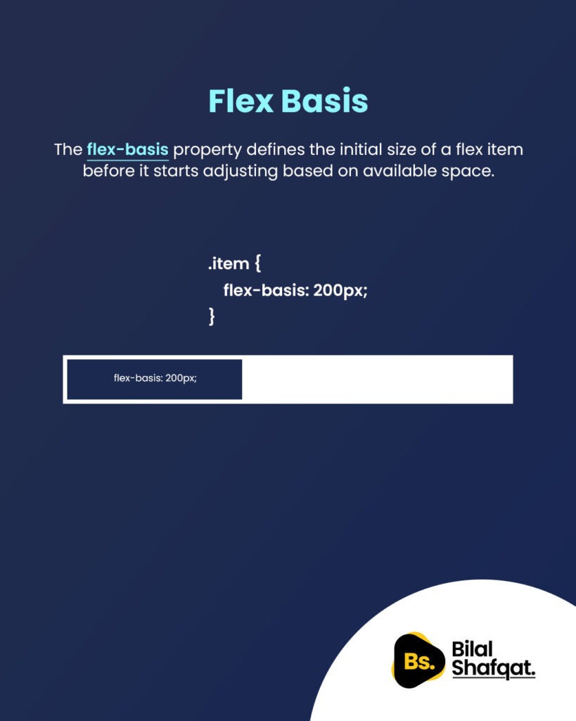
The flex-basis property defines the initial size of a flex item before it starts adjusting based on available space.
- It can be set in pixels, percentages, or
auto. - When combined with
flex-growandflex-shrink, it helps manage item resizing.
Example:
.item {
    flex-basis: 200px; /* Item starts with a width of 200px */
}
5. Align Self
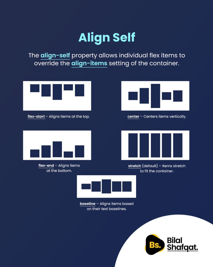
The align-self property allows individual flex items to override the align-items setting of the container.
auto– Inherits from the parent container.flex-start– Aligns the item at the top.flex-end– Aligns the item at the bottom.center– Centers the item vertically.stretch– Stretches the item to fill the container.
Example:
.item {
    align-self: flex-end; /* Aligns only this item to the bottom */
}
6. Flex Shrink

The flex-shrink property controls how an item shrinks when there isn’t enough space.
- Default value is
1, meaning the item will shrink if necessary. - If set to
0, the item won’t shrink. - Higher values make an item shrink faster than others.
Example:
.item {
    flex-shrink: 2; /* This item will shrink twice as fast as others */
}
FAQs about Flexbox
1. What is the difference between Flexbox and Grid in CSS?
Flexbox is one-dimensional (row or column), while CSS Grid is two-dimensional (rows and columns). Use Flexbox for linear layouts and Grid for complex, multi-directional layouts.
2. How does flex-grow work in Flexbox?
The flex-grow property defines how much a flex item should expand relative to other items. A value of 1 means equal growth, while 2 makes the item grow twice as much as others.
3. Can Flexbox be used for full-page layouts?
Yes, Flexbox is great for full-page layouts, but CSS Grid is often a better choice for large-scale designs.
4. How can I center an element using Flexbox?
Use the following:
.container {
    display: flex;
    justify-content: center;
    align-items: center;
}
5. Is Flexbox supported in all browsers?
Flexbox is supported in all modern browsers (Chrome, Firefox, Edge, Safari, etc.), but older versions of Internet Explorer may have limited support.
Conclusion
Mastering Flexbox in CSS is crucial for modern web design. It provides an efficient, scalable, and responsive way to align and distribute elements effortlessly. By understanding properties like flex-direction, justify-content, and align-items, you can create visually appealing, well-structured layouts without relying on outdated CSS techniques.

